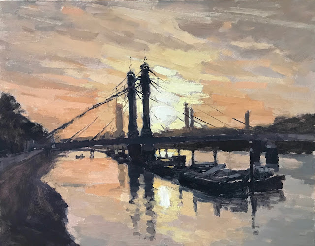
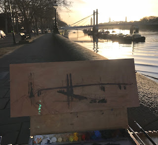
I did start a painting see below but when I went to work on it in the studio realised I was trying to get too big a picture in so I honed into the bit I really liked, not worrying that I cut off some of the bridge, just making sure the composition worked.
Also using a bigger board size than normal, which I enjoyed and worked well for the subject. I used larger brushes for as long as I could mapping in the darks. I graduated the tones from very dark of the boats, making it light as I went to the bridge, trees, background buildings... this gives a sense of space. Also as I lightened mixing the orange sky colour with the dark colour gives a feeling of light saturation - see the tall tower next to the dark bridge strutts.
The 'wires' on the bridge I put a main thicker one in first before the sky and other others after. Being bold with the strokes but a light touch as well - I use a Rosemary & Co Rigger. Where the sun was shining you couldn't see the wires so I didn't paint them in.
The boats needed surprisingly little painting, I put the main shapes to start in a thinned dark and then picked up the light on the top using a mid grey and nearer the sun a warm colour.
I'm really pleased with how this one has turned out.


The composition really does work and the word magical is spot on. I really, really like the depiction of the water and the beautiful quality of light on the scene. One of my favourites of your recent paintings.
ReplyDeleteHow could anyone not like this painting!? It has all the elements - the colours and description of the sky and river, the sunlight strong to silhouette the bridge and river craft, simply delightful.
ReplyDelete