Saturday 31 December 2016

One Year of Daily Painting!


I have committed to daily painting for a year!

Last Christmas I received the book called Daily Painting by Carol Marine. I hadn't heard of this term and it means to paint as often as possible usually small and in one sitting. 
I wanted to write about what I have learnt and my experiences of daily painting...

Daily painting is difficult!
I found it very hard to 'paint daily' it was usually 3-4 a week, but just having the mind set of small and often made me paint so much more than I did before. To give you an idea in the 2.5 years before last Christmas I managed 35 paintings. This year I have painted 151!

Painting often
Means I have improved massively, I have experimented with subjects, colours, techniques more than I have ever done in the past. I've painted subjects that I wouldn't have thought I'd enjoyed painting like shoes, food and jugs…I now see a painting subject in so many more things. I feel proud of the large and diverse collections of paintings in my studio.

Painting Small
Means I experiment more because the time invested is short so it doesn’t matter so much if it doesn’t work out. Experimenting leads to discovery, keeping it fresh and lively and always developing.

The Blog
Means I have interacted and had lovely comments from people plus had great numbers look in on my work (24,000 this year!). It is a blessing, although hard work to keep it going, but worth it :-)

The downside of ‘daily painting’
I did worry if I hadn't painted enough or couldn't post for some reason. At times it has felt a pressure to 'perform'. Also experimenting and having uncertainty on how a painting will come out and yet knowing I need to post something and show it publicly is very hard too! Plus prioritising whether to paint or be with friends and family.
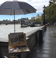
Plein air
Up until this March I had a fear of plein air painting - painting outside. I didn't think I could do it and had a block around it. Facing this has been a blessing and now it's actually my favourite way of painting, which still surprises me! The second half of the year I moved away from still life painting as I enjoy landscape painting more. Although I learnt a lot from the still life observation in my studio - colour mixing and tonal work. 

Every plein air painting there is a little adventure and the unknown of how the weather will be, who I will meet, what I will actually paint, and how it will turn out...quite a mix of excitement and trepidation. 
But again having done a few plein air paintings my learning curve has been massive, with things like how to apply the paint, translucent, thin, thick, translating the complex landscape subject into a 2D painting in 2-3 hours….I know there’s still lots to learn and looking forward to it!

What’s next...
I have decided to take down the term daily painter from my blog which will take the pressure off. But still paint as often as I did this year. I will be concentrating on plein air as it’s what I love and have a passion for. 
I will be continuing the teaching once a month and also working on my own painting skills. 

I hope you will continue to follow me and I would love to hear your comments on what I do. (people think they have to be qualified somehow to comment, not at all! Just say something simple :-)

Wishing you all a Great New Year & happy painting....

Friday 30 December 2016

#151 1936 Daimler

A long break without posting, due to lots of family and friends descending over Christmas plus I've have had the lurgie again!

It's surprising how tricky it was to paint this! It was a commission, for a father of a bride this year (who you can see in the car) and given to her at Christmas as a surprise.

I enjoyed painting it, the first couple of sessions are simple, blocking in the main shapes from dark to light tone and then its gets harder as you add the details without making it tight and stale. For example the wheels took a whole day to paint!

The person who commission this painting is very pleased with the result, which makes me happy! 
Thought you'd like to see a progress of the painting stages....


Sunday 18 December 2016

Speed Work & RBA


I have my sister here from South Africa at the moment but managed to do some painting over the last few days.

But first I want to say thank you for the lovely comments & emails I've had for my new website thank you!! Really pleased.

It's funny how things I set for my students often help me in different ways. I have started planning for the next term of work for them - looking at simplifying, paint aplication, tonal shapes...without fussing with detail too quickly.

What you do is draw out 8 boxes 2.5-3" square and then do a mini painting in each no longer than 10 minutes! It's tough, because it's still a propper painting with all the same  elements involved.
For me it's helping to really hone my observation skills and translating it quickly onto a 2D surface. I want to speed up the time it takes to do a painting outside and this is an excellent way of practising for that. The idea I developed from Carol Marines Daily Painting book.
There is no time for procrastination of the hard areas, no time for day dreaming or being distracted! Just pure focus and a determined mark making, really helpful. I hope my students will find it useful too.

I did the apples first experimenting with moving it around, and as it's small there's no loss in messing up a big investment of a painting to try things out. I worked on paint application thick and thin, especially numbers 6 & 7. You can see how much I improved from the beginning to the end. Painting the apple once and then doing it again it's surprising how much you remember and do it more quickly, like learning the subject by doing a sketch before you start painting. If I changed the set up a little like turning the apple around, it slowed me down again.
I then tried a cermic pot, which was harder, I liked the apple shape better but the colour of the pot was nice! Also did it a bit bigger 3" square and 12 minutes long.


Other news....
I entered the Royal Society of British Artists (RBA) Open Exhibition at the Mall Galleries in London and have been selected for the first round! I have to take the painting below in January and they will decide if it makes it into the exhibtion. All things crossed :-)


Wednesday 14 December 2016

New website launched today!


So excited to get this new website out there! Been working on it for about a month with an excellent web designer called Danny Fontaine (Fontaine Web Design) I highly recommend him. 

I wanted a site that would really show case my paintings. Simple, clean & contemporary. Having the blog shows daily work well but not so good for seeing my work as a group - like all my seascapes together.

I have a shop too, with a select few items in there as I will be selling in exhibitions as well.

My blog will be the same blogspot addess but will also link to my website.
   Click on the link above to take you to my site.

I would welcome comments below on it, let me know what you think :-)

Tuesday 13 December 2016

#150 'The Barns, Surrey Hills' 8x12"


This is the same area as the previous Surrey Hills painting I did (it's near Compton.) Although this one I traipsed down a steep hill to get this view. 
I made the mistake of arriving too early I got there at 7am it was still pitch black! If it's overcast then I should remember to go later! 
The light, when it did come up was very flat and minimal. I pushed the horizon line up high to take out the sky as it wasn't the focus. The original sized board was 9.5x12" I painted on this size and realised the foreground was too big and out of proportion for the subject. So I will be cutting it off, where I cropped it to post this.
Lots of comings and goings on the farm but I wasn't close enough to get the detail in. One thing I could do was paint the smoke, which looked good against the hill behind.

Monday 12 December 2016

#149 'View From Lambeth Bridge' 9.5x12"


I went to see the Royal Institute of Oil Painters exhibiting at the Mall Galleries and combined it with an early morning paint on the Thames.

A very grey day with a fine drizzle but still enjoyed it. So much hub-bub being on a busy bridge, very different to painting on the Surrey Hills! 
Met some nice people passing by, 3 police officers stopped for a chat one told me about The Houses of Parliament, the closest and biggest tower in the painting is called St Stevens and Big Ben is known as the Clock Tower, I didn't know this! 
It always encouraging when people are positive about my painting when I'm half way through it's a good boost and keeps me going!

I kept the paint quite thin and loose, it seamed to suit the day and weather. 
The exhibition at The Mall Galleries was excellent and inspiring :-) - It's finished now.

Monday 5 December 2016

#148 'Frosty Morning, Surrey Hills' 8x19.5"


I painted most of this last Tuesday outside in a very cold field and then I was struck with a nasty bout of lurgie :-( feeling much better now and raring to paint again!

A bigger board which allowed for a bigger scale and freer brush marks. The colours were mainly different tones of orange and blue (complementaries.) I mirrored some of the cool blue sky colour in the frosty ground below.

I arrived 40 minutes before the sun came up but I could do with having longer as when the sun comes over the horizon it changes the colours and tones massively. The photo below shows where I got up to before I had to abandon.


Finishing in the studio is always a little tricky as you want to continue with the essence of what you captured outside but to make it feel finished and complete. I was careful not to overwork the dark tree line keep it fresh and loose. The suns head popping up helps with the composition.
I will go back to this spot again :-)

Tuesday 29 November 2016

#147 Sunrise, Langstone Harbour 9.5x12"


Loved painting this! The sweeping shape of the mud flats and gorgeous light. I haven't painting the sun en plein air before. I had to be quick as it's dangerous to look straight at it, so once it peeked over the trees I tried to capture the glow, difficult with the intense colour and light tone. Also restraining how much yellow-orange I put in the rest of the painting to help the composition and give it more impact.
The mud I emphasised the red-violet colour and not the green seaweed. Putting in the big shapes first and the small details last like the mast and boats and birds. The sticky-up shape in the foreground I put in roughly to begin with and then went back to put in detail but when I looked up it was gone, the water comes in so quickly!

I painted this yesterday morning but photographing in the afternoon the result is so poor I had to wait to post it today, I'm missing the long summer days and more time to paint.


Sunday 27 November 2016

#146 The Barn, Woolfords Farm 9.5x12"


This is not a subject I would usually tackle. But I really enjoyed it. 
I have, with 8 other people started a group called The Surrey Hills Plein Air Painters and this farm was our first outing :-) I usually paint alone so it was really nice to paint with others. and I wouldn't have chosen to paint here but actually was really good.

When I first looked around the farm it was hard to find a subject to paint as it was so different to what I'm used to, it took a while to adjust to it. Luckily the weather was bright and sunny which produced strong lights and darks. 
I loved the cows in the barn and may go back another day to do a closer version I didnt feel confident enough to do it on Friday. They were moving about and eating their hay. 

It is quite a tonal painting I started with the darks (Raw Umber, Ultramarine, Red Iron Oxide), and worked up into degrees of light making it warm and cool, transparent and opaque. 
I adjusted the composition by painting in the apex of the barn even though in life it was further along, it seamed to finish it better.
It wasn't long until the shadow crept up the barn ond over the top leaving it with no direct light. I have got used to putting the darkest darks in - it can be scary doing it as it feels too strong but now I need the opposite for the lightest lights! Roger Dellar who is a good artist and in our group commented I needed the lights of the hay even popier. So I adjusted them and wham it came alive!

Thursday 24 November 2016

#145 Winter, Hayling Island Beach 9.5x12"


During the past week I have been working on a commission, I can't post it yet as it's a Christmas present. 

I have also been working along side a website designer for my new website, very excited, it's looking good and can't wait to launch it soon. I will continue as usual with this blog once the site is live.

Today I fancied being by the sea, it's a windy old day but enjoyed being out in it. The light is interesting and so different to summer. Warm apricot colours even in the midday sun. There's not much in the scene so I needed to get good variation of brush marks and tonal contrasts. 
I've just noticed I didn't put in two other channel markers in the distance, meant to do it when I got home - it was too windy for minute detail out there. Will do it tomorrow :-)
Happy to be out painting again....

Sunday 13 November 2016

#144 'Margate Harbour' 8x10"


This is the one I started last weekend in Margate with artist Michael. 
We trooped across mud and seaweed sinking and squelching. We were quite a distance from the slipway. Setting up our gear right next to the fishing boats and used them as tables. Standing painting my feet were sinking deeper and deeper into the mud, I had to give a good yank to get them out again! 
The tide suddenly was there and we had to make a dash for it, we'd only done about 30 minutes. 

I finished the painting today, not easy as I wanted to keep the essence of the light and loose feel but to put enough in to make it looked finished and pleasing.
I took a photo with my phone on the day but the strong low light didn't allow for any detail. Which is good in one way not to get bogged down with it but another was difficult to see what was going on. I tired not to 'explain' everything with my paintbrush but to suggest some areas too. 
I also ended moving the white boat on the left as in life it was squashed up against the boat in the middle. Usually I don't mess around with what is actually there but on this occasion the compsition looked awkward, now it's more balanced.
This painting is different to how I'd tackle it usually and I'm pleased with the result.

Saturday 12 November 2016

#143 'South Parade Pier, Southsea' 6x15.5"


I used to see this view every day as lived across the road and it's where I walked my dog and ran along the seafront. I lived in Southsea (Hampshire) for 11 years, so I am familiar with the pier. I have painted it a few times but never en plein air. 

Being a sunrise, time was short again so I didn't draw it out just blocked in the shapes and tones. It was nice not to painstakingly get each section of the pier drawn 'correctly' before I painted it, which I have done previously in my studio. It didn't take long to cover the board and on my first layer of the sky I didn't make the colours intense enough. It's difficult to get the balance between intense/saturated and light tone i.e. Not too wishy washy! I kept remixing to make sure it was bright but light enough. 
I also love the iridescent look that occasionally happens with the light on the sea. I wasn't sure how I would manage that.  But I did! Pale blue with the orange patches lightly over the top.
The man and dog did walk up the beach, plus the fishing boat puttering along the coastline, good to get some life into it as well.

When my husband saw this one he said fantastic! That's high praise as he's not one to gush :-)

Thursday 10 November 2016

Charity 'Pop Up' Exhibition


Today I did a one day exhibition of my paintings for a friend and student of mine Kim. She held it in her home with a coffee morning in aid of the local cancer hospice (Phyllis Tuckwell.) 
I took all of Kim's paintings down and put up mine! They suited her lovely house.

She raised over £500 and I was able to contribute to that as I sold a good few of my paintings :-) Always exciting to see them going to new homes! A good day but exhausting.


Tuesday 8 November 2016

#142 'Margate Beach' 10x12"


I had a really great day painting with Artist Michael Richardson over in Kent. It was bitterly cold with a north wind blasting us. But we managed two paintings this was the second. The first is half done because we were chased off the mud flat as the tide flew in!

This painting was a bit different because I tried one of his boards which was prepared with Gerstacker primer mixed with Raw Umber, the primer has a bit of tooth but paint still glided over it. You can see some ground colour left in the sky.

No drawing with a paintbrush before hand just blocking in the main shapes of general colour and really looking at the tone.
Michael noted that the view wasn't that amazing so I tried to 'improve it' with lively brush marks, putting them on and leaving them. Pleased with the result.

This is Michael wrapped up against the cold! (You couldn't see me for layers!)


Saturday 5 November 2016

#141 'Boats on The Beck, Staithes' 8x8"


I have painted a similar view on the last trip to Staithes in July (#87) I wanted to try again on our recent visit...
...When I got back to the cottage I was happy with it. The format was wrong for the composition and the paint application wasn't what I wanted. 
I left it until today when I looked at it again thinking can I improve this painting? The answer was no! It was fundamentally wrong eg composition. I have attached it below. So I decided to use the paintings from this area and do another one! Pictured above. 

Painting it again meant I had familiarised myself with the subject and so could draw it out more easily and concisely. I was drawn to the boats in the scene so that's what I honed into, cropped off one to improve the composition.
One of the troubles I had outside was the sunlight had come around quickly and was shining directly onto the boats so neither side had shadow. Which was so different to when I started it. 
I used a different method of starting today's painting. Mixing some greys, greens and browns and painting in the mids and darks even over the boat hulls and painting over the top wet into wet, bringing up the colour, intensity and tonal contrast. Which then gives a harmonious and connected feel to the whole. 
It also makes a big difference to the finish with what board you work on. The first landscape format was textured and grippy. The second square was a wood panel with 3 layers of acrylic primer, and slightly sanded as well. I like the way the paint behaves on the this finish more than the brought prepared panels. Very happy with the finish of today's painting, glad I tried it again :-)

Thursday 3 November 2016

Oil Painting Workshop Results

The first set of paintings were done on Tuesday by my Farnham class, we worked on tonal values using just two colours of Raw Umber and White. 
We made a strip of 7 graduated tones from light to dark trying to keep each step as even as possible. Squinting eyes to see the tone more easily and to check the strip for any big jumps, then adjusting when needed. 
Next stage was using the mixed 7 mixed tones for the still life, we also looked at composition eg placement on the board, scale, cropping, and paint application how much paint to use!
The second set is the class I taught today, in Haslemere same subject. I am so pleased with both classes results and how much they've improved :-)

Wednesday 2 November 2016

#140 Autumn Reflections, Blea Tarn 12x12"


When we arrived at this small lake it was still and so perfect looking it seamed almost to good to paint! I hesitated for a bit unsure as to whether I could do it justice. But then what the heck....and had a go. 
I wanted to try a bigger square format my previous size had been 8x8" so quite a jump but it was fun having a change and the subject lent it self to it.
The scene didn't have direct sunlight as the mountains behind me were obscuring the sunrise until later, but this soft light worked well.
I got the far mountain in first as it was changing so quickly and seamed the backbone of the painting. The red hill is usually green but with the bracken changing colours its a very rich red going into mustard yellow, fab to paint! And that iconic tree on the waters edge. The last time we were in The Lakes I drew it as I wasn't painting outside then so it's great to have done it now :-)
The reflections were hard because if you don't paint them at the same time as the top half you have to remix and paint it for the second time below! Also getting the direction right to make sure its a mirror image - not easy! I used thinner paint and scrubby brush strokes plus slightly paler in tone to describe the reflections.

Tuesday 1 November 2016

#139 'Mist on Lake Windermere' 6x15.5"


A beautiful and still morning on Lake Windermere. It was frosty, zero degrees and very cold hands and feet, but I didn't really notice until I finished as I really enjoyed painting this scene of soft light and pastel colours. 
Initially I was waiting for the mist to clear to paint what was behind it and then I decided to embrace it! 
The yacht was moving 360 degrees about every 20 minutes so I caught it at this point thinking it was a less obvious view than to side on. The boats on the left were tourist pleasure cruises, and they were warming up ready to leave so it felt a little pressured not knowing when they would go! 
I included the jetty to help with composition as the diagonal line of it leads you into the painting and breaks up the horizontal bands - same with the mast of the boat.
This is when a panoramic format works well and I'm really happy with the final painting :-)
I would love to hear your comments on what you think of it....

Sunday 30 October 2016

#138 'Lake Windermere' 8x10"


We are back now from our vist to the Lakes & Staithes. Really enjoable trip painting such amazing places and so it was a very productive 8 days! Lots to post on here... It was difficult to post while I was away as we were out for long days in the Lakes making the most of it!

Sometimes paintings are a real struggle and whatever you do they just don't work. I was working on a panoramic format of hills and lake, it was the composition I was fighting with. So I turned around and was dazzled by this contra jour scene, loved the drama and simplicity of it.

Wednesday 26 October 2016

#137 'Sunrise, Staithes Beach' 9.5x12"


This is the last sunrise from Staithes, I have enjoyed painting at this quiet time of the day and capturing the beautiful colours which are so quick to disappear. 
I have been experimenting with thicker paint, and not doing an under painting to start, just doing it in one thick go. Which is working well unless I'm being indecisive or unsure about an area and then the paint gets too thick, so I scrape off and start again! I like the thick lucsious quality of the oils although it's harder to control when there is loads of it on the board.
The early light really influences the whole scene, so to harmonise the palette, every colour mix I add a dab of peach colour from the sky. 
I painted this Monday morning we drove to the Lake District straight after. Lake paintings to follow :-)

Sunday 23 October 2016

#136 Sunrise The Beck, Staithes 9.5x12"


Another windy morning but lucky with the rain and had some great fluffy clouds. I really enjoyed painting the sky, a real test of observation under limited time.
I had to strap my pochard to the railings as the wind would blow it over and difficult to do any detail as it buffeted my arm.
But I still enjoyed it! A' large' painting with lots going on, I used a connected palette of colour, linking my mixes so the painting is harmonised.
As I painted the sky the clouds and colours just kept improving. which is frustrating when you have committed to certain cloud formation and colours. I did add a light orange glow on the horizon but to have added anymore I would have needed to scrub it off and start again. It's getting the balance in changing to improve but not obliteration what you have. 
It feels as though these paintings are at the limit of my comfort, pushing with size, application of paint - making it thicker, challenging subjects, composition, and the elements! I hope it will help my skills in the long run :-)
You can see the same little fishing boats I painted in yesterdays sunrise painting.
I now have another two other paintings on the go which I have started here (both tricky!) I will complete them soon. I wanted to get them started here as there's so many areas I'm itching to paint, and we leave tomorrow morning for the Lake district.... 

Saturday 22 October 2016

#135 'Sunrise, Staithes Harbour' 8x10"


Haven't posted in a few days as I was prepping for an eight day painting trip we are now on. My husband and I are away in North Yorkshire Staithes, a small fishing village I previously visited in the summer. It's a really inspiring place and everywhere you look is another painting opportunity.
We started this morning and I did this one at the top of the village looking down on the harbour. It was bitingly cold with the wind in my face and my fingers slowly seizing up with cold.


There were so many options for compositions I choose this view as it had all the elements I like! 
I put the sky in as it was changing colour fast. getting the tone light enough and a good intensity of colour, the sea came next as it mirrored a lot of the colour in the sky, with sweeping strokes for the breaking waves. Putting the cliffs in was a bit of a shock with the tonal contrast but with it helps make the sky look pastely and soft, I kept the cliffs fairly translucent and dark. Then to tackle the roof tops! I focused on the sky line as that was the interesting bit with getting the angles of the roofs and chimney pots, also changing the tone and colours of the red slate. The miniature boats were just a suggestion with hardly any detail.
It took 2.5 hours, a long time whens it's cold, but I felt happy for being there and the painting at the end.
I did another one in the afternoon but it needs more work so will go back tomorrow and finish it.


Sunday 16 October 2016

#134 'Gladioli' 12x24"


Having made a detailed study drawing of gladioli in charcoal (posted Sept 28th)   I wanted to have a bash in paint. Couldn't get the same colour which was deep pink but these orange-red were still very vibrant and lovely to paint. I put in the dark tones first and then lifted the tones in stages to the lightest on the petals. Plus the vase, really looking to see how the water distorts the size of the stems. 
I had prepared the canvas with a coat of acrylic primer but it was still very toothy and rough so I used a fine sandpaper to smooth it down, which worked well. Working big was fun and different to my smaller pieces and will try more. Although it's not possible to do the painting in one day as it's too big, this one was at least two.

Saturday 15 October 2016

#133 'Lyme Regis Harbour' 9.5x12"


This was the final painting I did in Lyme. Absolutely loved painting the fishing boat, and emphasised it in the composition and the detail which I included. I spent 3 hours on site painting and was exhausted afterwards, a really complex subject but the sort of thing I want to paint more of. 75% finished it and then did the rest in the studio. I have included my palette below from the studio as it shows how many colour mixes I had to, not including my outside palette! 


There was a pile of fishing nets that I squeezed behind (see below) thinking I'd be out the way and in a quiet spot. It turned out the Harbour Master was doing some stuff and I was right in the way, but it meant I got talking with some of the fisherman who were really friendly and one said his relative owned the boat in my painting and that the boats name was rude and best not to have that as the painting title! I can't say what it is but I didn't paint it on :-)


I put a lot of extras in like the windsurf boards, people, flags as I thought it gives life to the scene, I'm really happy with the overall result.

Wednesday 12 October 2016

#132 'Charmouth Beach, Dorset' 6x15.5"


Charmouth is just a couple of miles from Lyme Regis, the cliff in the middle distance is called Golden Cap and is the highest point on the South Coast, it's completely flat on the top.
I watched an inspiring plein air painting DVD by Richard Pikesley and he was painting on this very same spot! 
Love this sort of coastline and could paint here every day. Just the changing weathers, light and tides :-)
P.s. My painting is photographed on the easel because a narrow panoramic format doesn't work so well on the blog - it's too small.


Tuesday 11 October 2016

#131 'Sunrise, Lyme Regis' 8x10"


This weekend Husband and I had a whistle stop trip to Lyme Regis on the Dorset Coast. We only spent 26 hours there but enough to explore and do 3 paintings :-)
This was actually the second painting, I want to revisit the first tomorrow and then post it.

Gorgeous, calm sunny morning, although very chilly! Sunrises tend to be more fleeting than sunsets, so you have to paint like billio to capture the sky and light. I enjoy the challenge! Most of the painting is a variation of blues and browns/oranges and then it's getting the tones right and working together.
I didn't now how I was going to tackle the little bit of town showing as it was a mass of buildings. Simplify! I put a sweep of dark and then painted over the top with lighter shapes, picking out the roofs and taking care to paint the skyline carefully.

Thursday 6 October 2016

#130 'Rainy Day, Victoria Embankment' 9.5x12"


This was the painting I started last weekend outside in London.  It was a complex subject and good size painting to tackle en plein air and in the rain! See pic below.


I used my 'Best Brella' for the first time and it was a boon! I couldn't have painted otherwise as it was raining too hard. Didn't stop me getting cold and wet but my palette and painting was dry! You can buy the pochade umbrellas from America, same people as the Palette Garage.
I experimented with colour themes I wanted to emphasis the rainy grey day but when I got the painting home it looked very grey and washed out. So I left it to dry and re worked it, I'm happy with the result, especially the composition.

Sadly I didn't get into the Royal Institue of Oil Painters Exhibtion. (ROI) But I'm really pleased to have got 2 paintings through the first round, it shows I'm on the right track and will keep trying with the London shows :-) Some stats for the ROI all approximate: 1000 people entered online 300 got through the first round 95 through into the final exhibition. 


Monday 3 October 2016

#129 'The Bridge, Waggoners Wells' 9.5x12"


A beautiful sunny day and great to be out painting again for the 3rd day in a row! I previously painted this bridge and trees from the other side on the 18th September no.124. The leaves are just turning and the ones one the ground are orange, which I made full use of :-)
I put the struts of the bridge in before painting the water, plus the dark tones of the tree trunks - see pic.

I painted the background trees and their reflection at the same time, lightening a little for the water. Putting in all the dark areas under the bridge, which then showed up the light in tone of the little waterfall. Fun to paint moving water! Quite a big painting for me and plein but satisfying to do. Will go back to Waggoners when the leaves colour up.

Sunday 2 October 2016

#128 'Surrey Hills' 6x15.5"


Lovely light on the morning hills, really blue and pale. I used a new wood panel by Gerstaeker called Tintoretto, I had prepared it with three layers of acrylic gesso, and it was really nice to work on, the paint glided but didn't sink into it. No need to frame either as its a box style.
I was careful to get the tone right of the hills as they weren't much darker than the sky. I used a new colour - Cadmiun Orange. Quite potent use very little of it, mixed with Lemon yellow for the sky line plus I then used the mixed orange into most of the other colours this helps with the harmony and giving it a warm feel. It was fun to paint on the panoramic style I recommend having ago if you haven't tried it.

I went to London yesterday and did a plein air next to the Thames, it was raining and I choose a tricky subject, it needs work so will post soon.

Thankfully my dog Matte has turned the corner and is better although his sight hasn't come back yet. But he's well enough for me to get out painting again :-) and thank you for your good wishes for him.


Wednesday 28 September 2016

'Gladioli' 20x30"


I fancied getting my teeth stuck into a large (nearly life size, A1) charcoal drawing. We had these flowers which were on their way out but still great shapes. 
I used a fat charcoal stick for most of it which was like a paint brush I wanted it to be bold but delicate. To really observe every area and as I was doing it reminding myself 'dont assume what it looks like but to really look!' I used the negative shapes between the flowers to help. I also used a rubber drawing with the charcoal first and then sculpting the shapes with the rubber and then redrawing over the ghost shape again. The tone was interesting too with very deep pink flowers darker than the greenery and a fine balance in getting the flowers dark but not too heavy looking.
It took all day to do it, quite satifying watching it emerge, and doing something large scale.
Drawing is so helpful for painting skills.