

When I began this painting I had no idea whether it would work as I wasn't sure how to tackle it.
Here is my tip:
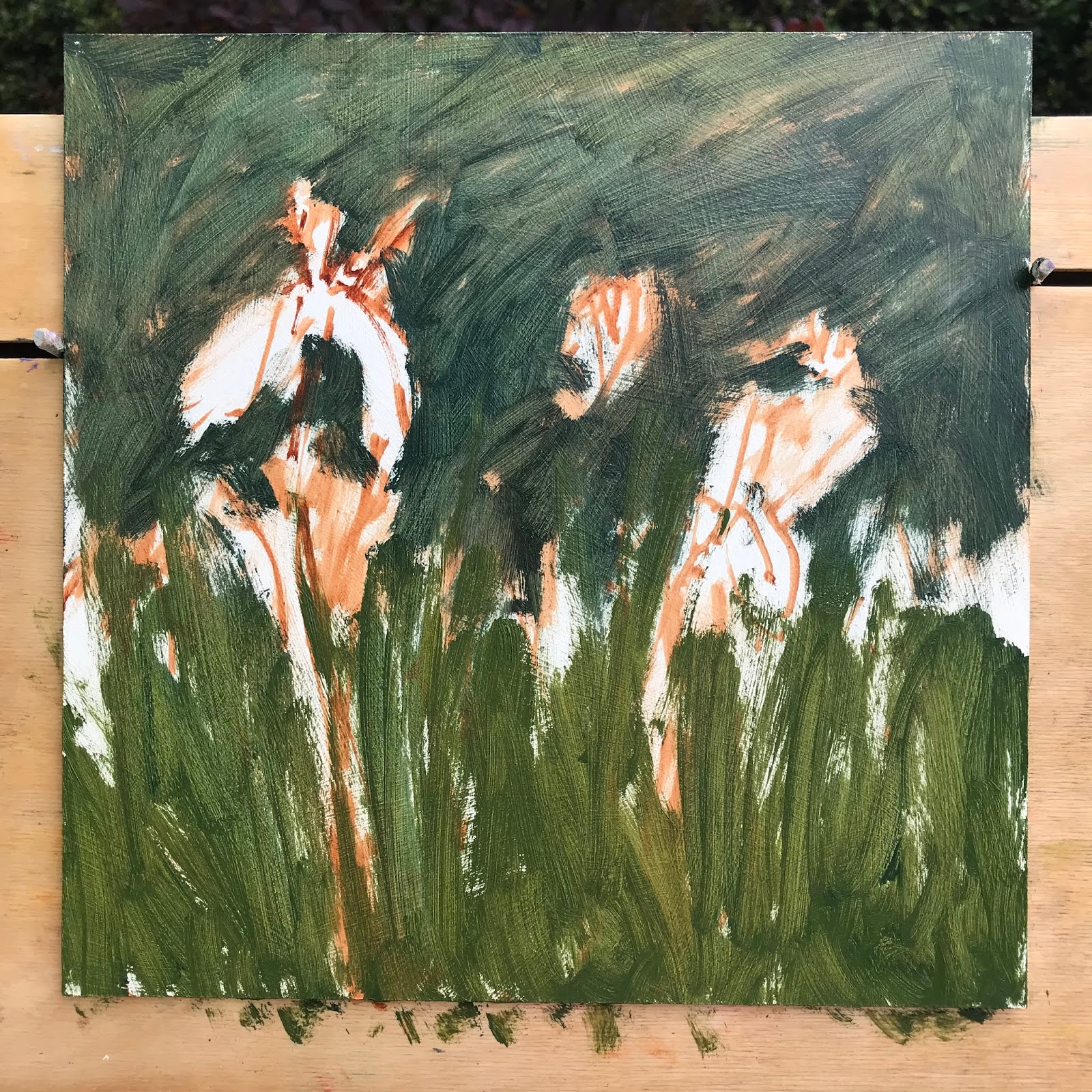
If you are struggling with tonal values in your painting take a photo on your phone of your subject and your painting. Change from colour to black & white this way you can compare the tones to your subject and you painting and see if all the areas are working, and whether it needs to be adjusted, this is early stages:

The colours where ok but the tonal values of the colours too similar.

So I darkened the background and lightened the petals and Iris foliage area.
I also warmed the flower colour to pinky purple which goes better with the green.
Thank you for the stepped photographs and explanations. Your resultant painting is amazing.
ReplyDeleteWow a real beauty!!
ReplyDelete