Showing posts with label Beach. Show all posts

Monday, 22 July 2019

#473 West Wittering


A commission. I don't do many, as I tend not to advertise, but I'm willing to do them if people ask. This one was for a ladies 50th her siblings got together to buy it for her as a surprise.
Sadly they didn't give me much time so had to go when it wasn't sunny! This was actually my second attempt the first was blowing a hoolie and awful, at least this time it was atmospheric and the sun came out for 10 minutes!

They ended up buying another one I did from a photograph of sunny West Wittering! At least they were happy :-)

Monday, 28 January 2019

#434 'Old Fishing Boat' 24x30cm


I liked the colour combination of this, very Mediterranean looking.  I used my location sketch to help with the composition. Painted with long flat brushes gives a quality to it. The rusty old winch gives an extra element and helps composition. Tried to keep it fresh and bold.

Sketch studying 4 tones

Thursday, 29 November 2018

#419 'South Parade Pier, Sand Reflections' 20x50cm


When I arrived I was initially disappointed as there wasn't much to the scene, the tide was still in and the sun wasn't up so no colour, quite dull. But the tide soon went out and the colours appeared in the wet sand. Beautiful! 


Wednesday, 15 August 2018

#363 'Early Morning, South Parade Pier' 11x14"


I started this a couple of weeks ago but didn't have time to finish it en plein air so I've just completed in my studio.
Its a familiar subject as I used to live near by, although I haven't painted it up close before and with a radical cropping! When I was looking at it a little sail boat came into view it looked great framed with the strutts of the Pier. So I thought to focus in on this part instead of trying to capture the whole thing.

Quite a complex beast!  I wanted enough information without it looking stayed and stiff, so I didn't finish everything off - I'd leave bits for the eye to fill in. 

The beach was empty being 8am, just an occasional dog walker I decided to put him near the pier so his lighter blue top stood out next to the darker areas. Also not so obvious in the composition.

The sky was a darker blue than the usual milky skies we can get, quite tricky to get it dark without it looking too heavy. I had painted it on once and scraped off and then brushed on with less paint & more medium the second go.

I was drawn to the white building next to the blue sky. I used a very subtle mix of whites, tinted with grey/violet and warmed with yellow. Also combining Titanium White and Michael Hardings Warm White

My Mum who lives near this Pier said they have put flags on the poles and it looks really good. Tempted to add them in for a bit of colour and more interest?
Initial tonal underpainting

Tuesday, 14 August 2018

#362 'Sandymouth Beach 10x12"


Last painting in Cornwall. I really enjoyed this part of the world, it helped to have amazing weather, light and skies!
This is a wet sand and sky painting. I worked on the tones - the sand was surprisingly dark and the sea even darker. I tired to paint the waves over the top of the dark sea colour it didn't work so I wiped out wave shapes with kitchen towel and was able to get a better purchase and make the waves light enough.
The wet sand puddles were quite dark too, reflecting the sky in colours. People went into the sea as I was painting which helped with scale and interest.

I did some sketching through the trip so hope to do more paintings of Cornwall in the studio...

Sunday, 12 August 2018

#361 'Crackington Haven' 11x14"


A large imposing cliff the locals call Sleeping Dragon. A great paintable subject...with low tide and the water on the sand reflecting the cliff and sky. People to give scale and interest plus the colourful life guard flags. The sky I'd taken time to put in the sweepy clouds and then some fluffy dark clouds came over the top so I took a risk and painted fluffies over the top, I'm pleased with how it turned out.
It was quite a big board but works well with the huge cliff.
I was lucky as I was just finishing up and then the rain fell...
Rain clouds approaching!

Saturday, 11 August 2018

#360 'Widemouth Bay' 20x50cm


The North Cornwall surf was so much fun to paint! 
Looking the other way the beach was busy with people, life guards and surfers, it looked interesting but this way attracted me more because of the colours. - Looking into the sun creates strong tonal shapes and less colour, looking away from the sun i.e the light shining directly onto the subject makes the colours strong and less about tonal values.

Although I still worked on the tones I compare what is a similar tone within the subject:
sky and the sand are similar 
The distant sea and the rocks 
Wet sand & foreground sea - squint your eyes and have a go!

The sky was changing with lots going on in it. The foreground rocks helped with composition, the tide was high so only the tops of them stuck out it was good to have the water around them - low tide it's just a mass of rocks.

Spot the ring of sandcastles, they were making them as I was painting, I decided not to include in my painting.
This is one of the those paintings that did it itself. Hardly any wiping off and quite quick to get it all in.They dont all happen like that! 

Friday, 10 August 2018

#359 'Sandymouth Surf' 8x10"


A quickie in the early evening light. I put the marks down and left them, an impression of the moment. 
The people walking into the shallow sea with their boogie boards. The light on the water so strong almost to much to look at it. See pic below...

Beginning stages, rough silhouette of people and waves, yellow base colour before the white light.

I stood right next to the water line but the tide zoomed out so fast it was miles away by the end of the paint.

Tuesday, 31 July 2018

#356 'Early Light, Southsea Beach' 9x12"


Good to get back to plein air painting as I had a week in the studio doing commissions, finished and happy :-)

A quick painting session this morning before piking up our shared dog (Matte) from my Mum in Southsea. 

I was really pleased to find these great shaped clouds and contra jour sparkling light on the water!! 
I didn't do any of the usual things before - like sketch and mix piles of paint... I just got the board out and did the sky straight away, as it was breezy and the clouds were disappearing to my right fast.

The tonal values were really important getting the lower half of the sky darker than the sparkling sea but still a yellow glow. The light on the clouds were lighter than the overall sky but darker than the sea sparkle. A lot to assess in a one a hour painting!

After this one I turned around and started another this time of an old friend South Parade Pier, painted many times when I used to live in Southsea. Sadly I ran out of time so will post when its finished!

Tuesday, 20 February 2018

#304 'Afternoon Light, Woolacombe Beach' 8x14"


The last painting of our Devon trip....

Nipped home for lunch and came straight back as we knew the light was going - rain due. I didn't know what I would paint which often happens, you just have to see when you get there what looks good and inspires.
This was it, actually the same view as I had done an hour or so previous!
This time the sun had come around to make it more contra jour, the clouds were building and the light and colours quite soft.
This is how I started getting the main shape of the cloud and the shape of the light.

Having the strong foreground rocks makes the rest looks light and soft. Keeping the palette limited and harmonious helps to make it look contra jour. Not putting in too much detail as its a big view. 
Hope to go back, an inspiring place :-)
Painting on the cliff top

Monday, 19 February 2018

#303 'Woolacombe Beach' 8x14"


Quite often when I'm painting I would look around the in the other direction and there is another painting to be had! I saw this sky when was I painting the previous post - 'Morning Shadows, Barricane Beach'.

Some paintings are real struggle but this one did itself.
Making the spit of land (Baggy Point) a small scale helped to make the expanse look big. Also putting the little people in - spot the walking surfer!
The foreground rocks were in a straight line which didn't work for the composition - too many horizontals, so I broke the shape up but still showed they were there and making it the darkest tone.

Saturday, 17 February 2018

#302 'Looking down on Barricane Beach' 10x12"


Had a great day today, 3 paintings and lovely weather! 
This was my first, a challenge to say the least. The rocks were hard, to get the tonal differences right and working with the rest of the painting. The sand shadow may still need work, it started off a bit dark so I lightened it and maybe a bit warm. 
It's hard to tell in one alla prima paint, looking the next day you often see things you didn't see the day before! Here it is before I reworked it:

First stages...Squinting my eyes to simplify and blocking in the shadow areas and linking the shapes together. You can also see how strong the shadow was in the photograph.

Perched on top of the cliff, tide going out, sea looking bluer than when I began. It was fun painting the little people too - gives it scale.

Thursday, 15 February 2018

#300 'Barracane Beach' 8x10"


I felt out of my comfort painting this, not used to rocky shorelines and big waves! But it's good to push the skills and enjoyed painting it. 
Quite a sheltered spot and by the time I finished full of children and dogs! I decided not to include them as I had already mapped in and to go over the top doesn't work as well as including them in the beginning and painting around them.
Although I did have a little episode with a dog, a women shrieked as a dog came running towards me, and I wasn't quick enough to stop him peeing on my art bag! The lady was mortified, 'he's an old dog' she said. I understood having an old dog ourselves but still my bag was now a target for other dogs (the smell)!!
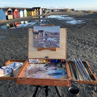
It was a beautiful morning although you can see a cloud front had come in and started to rain as we left.
I put the darks of the rocks first and made sure the lights of the rock weren't too light. The sea was quickly receding in low tide so had to get it in before it went.
I would like to paint this again now that I am more familiar with this subject.

Wednesday, 14 February 2018

#299 'Sunset, Woolacombe Beach' 8x14"


I painted this one straight after the first, as I was upset with that painting (it had been a struggle!) Also the sunset was amazing and I wanted to try and capture it in paint.

I only painted for about 40 minutes as it was over by then and nearly dark! (very cold too!)
I think it needs a bit more work will have a look at it when in the studio at home.
here is the beginning:


When its predominately a sky painting I start with the clouds if they are strong like these ones. Mapping in the main shapes in a warm and cool similar colour. Then to the sunlight, as it will change quickly, how it effects the clouds, what colour the light is - cool white or warmer yellow. 
There was also no need to draw before I started the painting as it was about colour and light less structure that needed to be drawn out.

#298 'High Tide, Woolacombe Beach' 8x10"


My husband and I are in North Devon for a week, to paint, photograph and rest. This was my first painting, it was tricky as I forgot my plastic palette insert for my pochade so mixed my paint on the back of a board (not ideal!) It's surprising how just one thing can throw you when plein air painting.  Also being contra jour the light on the water made looking at my painting difficult so I ended up turning the pochade away from the scene and looking over my shoulder at the subject!
It's mainly a tonal study keeping the colour palette limited and trying to observe the tonal comparisons eg is the sky the same tone as the sea?
After an hour or so I scraped off areas, painted over parts I was not happy with it, but got it home and it wasn't as bad as thought! So here it is, 
Here's the start:

Friday, 9 February 2018

#296 'Storm Approaching, East Head' 8x12"


We knew a storm was coming and only had an hour or so to paint, I was with artist Sarah Manolescue.
Finding a spot that wasn't in the direct line of the gale was tricky. I liked the dunes being lit by the sun and the building clouds as a backdrop.
The people gives it some scale and with a very limited palette:
I used the green mix for the violet and yellow mixes. Sometimes that works to mix one colour with all your other mixes - helps to harmonise. Yellow & Violet are complimentaries and I pushed the sky to a more violet colour which helps the colours zing!
I warmed the yellow with Burnt Sienna on the right side and also put burnt sienna in the violet sky mix to link the two. 

Wednesday, 24 January 2018

#289 'Winter, West Wittering Beach' 12x16"


Very windy day but beautiful light. I got sucked into the big view and used a big canvas. I was pleased with the bones of it - composition and the sky but then I got home and it underwhelmed a little, I think the colours were too muted and so nothing to loose I scraped back with a palette knife all of it a part from the sky! It's still there but with no paint texture - see pic below.
Scraped back wet paint but subject still there
Out on location ....I painted the sky first and I was aware I was taking too long to cover the bigger area. It's too long because by the time I got to paint the beach the tide was coming in and and there wasn't much left of it! The light on the sand is my favourite bit...Comparing the tone and colour to the sky.
The canvas (Belle Arti Linen Fine weave) was different to my boards, not used to the texture and I use my hand and rag quite a bit to wipe paint and move it around or soften edges, this is harder with a canvas. 

Back at home after I'd scraped back the excess paint and left with a ghost. I repainted the green area of the sea, making it more intense and thicker paint, Blue-Green in the distance and more Yellow-Green closer to us. (The shallow water & the colour of the beach effects the sea colour.)
The colour of the foamy waves are tinged with a peachy colour (not pure white) 
The line of darker sand I mixed a colour similar to the clouds just darker in tone and keeping the edges soft. I'm pleased with the outcome :-)

Monday, 15 January 2018

#284 'Beach Huts, West Wittering' 8x10"


I was drawn to this subject but wasn't sure if I could paint it! I enjoyed painting the huts that morning so I thought I'd try.
The reflections adding an extra element and interest - it had been a recent high tide and puddles were left.
I used my viewfinder to honed in to the colours and shapes I liked.

This is how I started blocking in the darks using a thined dark blue or brown - Ultramarine & Burnt Sienna. Remembering to repeat everything if it's reflected in the puddle.  

Beach huts are wonderful subject, but I didn't want them to look cute and twee if you know what I mean. So I painted them loosely - not too many straight lines or crisp edges.
The water reminded me a bit of snow quite light in tone and soft edges again, the shape was fun too.

It was the first day of using my brand new pochade, see below:
It's called an Alla Prima Pochade by Ben Haggett in America.
It's easy to set up, well built and nice to use but not comfortable yet, I used my previous pochade - Open Box M 150+ times, time will tell! 
I will do a blog on pochades and tripods soon....

Saturday, 13 January 2018

#283 'Morning Walk, West Wittering' 8x14"


A lovely morning a couple of days ago with strong low winter sunshine.

When I paint I try and work on it as a whole without spending too much time on one area but there is often a part in a painting that I avoid or leave longer than other areas this time it was the beach huts. I wasn't sure how I'd tackle them..... I massed in the darks - squinting my eyes to see the shapes, making it either blue or brown. Painting them loosely and without regiment - matching how they were. Then being bold with the light tones on the fronts of the huts. Also picking up the light on the top of the groynes there's not much there but it makes a difference to the feeling of light.
The sky I found tricky as the sun was so bright I couldn't see it to determine the colours! But happy with how it turned out.

The lady looked good in her long coat and helped with the composition as there was a gap there, I put her and the dog in quickly in one basic dark colour, adding light and the shadow after.

I tried out my new pochade on this painting, the light was too glary to get a good location shot of it so will post it on the next painting which was also at the Wittering's.

Saturday, 6 January 2018

#281 'Last Light, Seaford' 8x14"


This one I scraped off after nearly covering the board as I wasn't happy with it and liked the light better as the sun was setting - warm apricots.
It does seem to take a while to get to know a place, especially a new subject like white cliffs! 
Scrapping off gave a nice base to work over, which I did some on location but finished today in the studio. I realised I hadn't pitched the cliffs light enough so lifting them in tone meant I needed to lift everything else as well. I left some of the original painting showing through to give a more interesting finish.


Here is my palette of colours.
I took this pic after the sun had gone down.