Showing posts with label Yellow. Show all posts

Tuesday, 13 August 2019

#480 'Sunflower and Buttercups' & Daily Painting


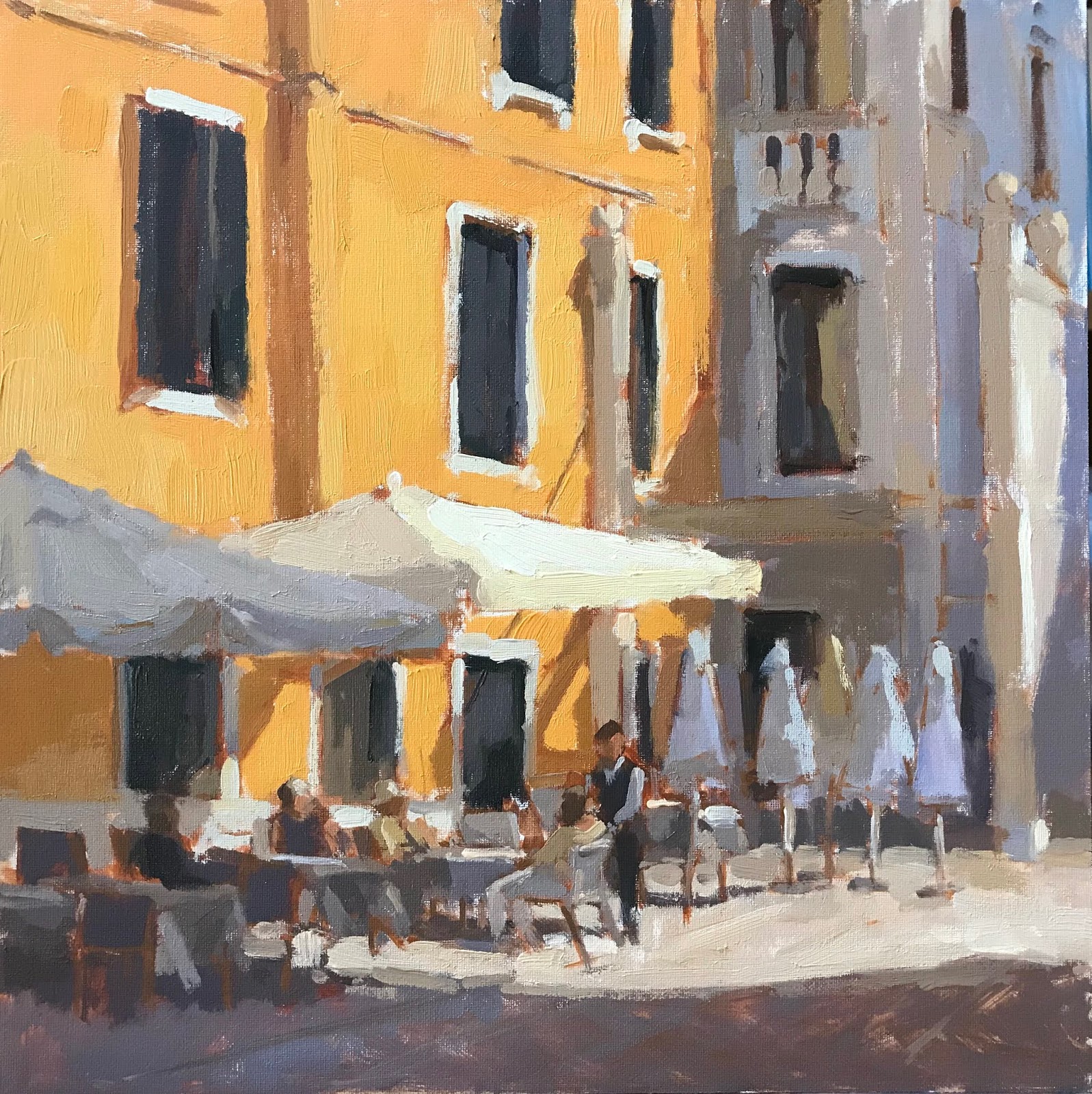
I had an hour to spare in between commitments. It would have been easy to think - I don't have enough time to paint. But it made me focus and work quickly and with intent, no procrastinating! It's come out and fresh and lively. 
I committed to a year of 'Daily Painting'  in 2016. Where I painted small and often tackling a wide variety of subjects like cupcakes, shoes, jugs and flowers. It was such fun and so helpful for my development of skills and confidence. I recommend Carol Marines book on Daily Painting. It's a gem!

Wednesday, 7 August 2019

#478 'Sunflowers in Glass Jug'


I fancied another go at these lovely blooms! Using a sky colour as a background - Kings Blue Deep and Cerulean mixed together. On a bigger canvas - 16x17" 

Saturday, 27 July 2019

#475 Sunflowers


An apt flower with all this sunshine and heat! I seem to paint flowers better when they are in the garden instead of inside my studio with sunshine falling on them. 
Chunking together petal shapes not painting individuals.
Cadmium Yellow deep a useful colour & mixed with Cerulean - for the background.
The composition took so long to arrange and paint and repaint - over an hour of doing this. But it pays off, and I like how it fills the edges and suits the boldness of the flower. Also looking at the ellipse brown centres, drawing them correctly and not to even shapes across the canvas.
14x15" oil on canvas

Monday, 11 February 2019

#443 'Silver Birch in Snow' 30x30cm


This is the first one I did as the sun was going down on Bramshott Common. Different colours to the previous bluer snow paintings. Mainly yellow and oranges, limited palette. 
I painted another straight after (will post tomorrow) in a portrait format to get the trees in....

Sunday, 10 February 2019

#442 'Snow Shadows' 30x40cm


The second painting done straight after the first. You can see how much the sun has moved to the right and rose. Warmer blues and lots of colours in the snow! But also a limited colour palette - warm and cool.
In this one I wanted more of the shadows as I didn't get to emphasis them in the first painting. So I used a bigger board, portrait format and a high horizon line. 
I'm pleased with the result :-)

Putting in the bit that will change the quickest first- the shadows 

Friday, 14 December 2018

#425 'Venetian Cafe' 30x30cm


This week I have been looking after the family Shih Tzu dog, while my Mum is away. He is 12 and has lost his hearing from old age, plus he has gone blind from bad breeding, poor sausage, so it makes painting a little tricky! But I did manage this one in the studio with snatches of 10 minutes of time in between checking on him in the house!
Matte
This scene I couldn't resist with the yellow wall so bright and glowing in the sunshine, it was my last day in Venice so I snapped a pic and did a quick drawing and here is the result! The Square is Campo Santo Stefano and its the 'Art Blu Cafe'.

Saturday, 27 October 2018

#408 'Sunflowers series of 3'

 33x35cm oil on linen

16x18" oil on linen

40x40cm oil on cotton canvas
All from the same bunch of flowers. Experimenting on linen canvas - with clear gesso, so its still buff canvas coloured.
Composition - just the heads and a hint of the vase no.1
Old style 'masters' colours with a goldie background no.2 
Provence French blues and yellows, square more contemporary feel no.3 

Thursday, 18 October 2018

#406 'Sunflower & Berries' 8x14"


Oil on muslin covered board which I'd made myself.
Thicker paint and experimenting with medium - GAMBLIN : GALKYD GEL OIL PAINTING MEDIUM. Speeds the drying time and adds a glossy thickness.
Purple to compliment the yellow.
Colours from the painting put into the pattern on the jug!

Thursday, 4 October 2018

#397 'Gondola Ride, The Grand Canal' 8x14"


We went back to this spot to do it again! With a wider format board and looked at the aerial perspective, there is a lot of sky colour put in the distant buildings.  The colours of the sparkle are tricky to see, but they start warmer yellow/warm colour and go to a lighter whiter colour in the middle.
Perched on the end of a jetty, Sally my painting buddy had a one paint brush casualty over the edge!

Tuesday, 2 October 2018

#394 'Campo Ognissanti, Venice' 9x12"


I've not painted this before, canals are always a challenge this one was in contra jour which helped to simplify the tonal shapes. With morning light so the sky is a warm yellow, the sparkle moved across the canal and was gone within the hour. The boat in the foreground helps with composition a larger shape against the smaller houses. The skyline is the fun bit to paint the lovely dome and chimneys!

Painting with artist Sally Balick on a quiet locals area in Dosoduro.

Friday, 10 August 2018

#359 'Sandymouth Surf' 8x10"


A quickie in the early evening light. I put the marks down and left them, an impression of the moment. 
The people walking into the shallow sea with their boogie boards. The light on the water so strong almost to much to look at it. See pic below...

Beginning stages, rough silhouette of people and waves, yellow base colour before the white light.

I stood right next to the water line but the tide zoomed out so fast it was miles away by the end of the paint.

Thursday, 9 August 2018

#358 'Morning Light, Kingsand' 8x10"


I walked for miles trying to get a view with the Cornish houses and sea behind but nothing looked right and then I saw this simple but lovely subject, with old looking boats and amazing light. 
Unusual yellow sky, contra jour sea sparkles, it was a quick painting to capture the moment.

I enjoyed watching the children jump into the water next to me, lots of squeals and laughter especially when a jelly fish got in the way!
Spot the kids behind my easel.

Friday, 6 July 2018

#351 'Sunflowers' 12x12"


A busy week, hard to keep on top of all the artists jobs to do, including this one!

I am lucky that my Mum supplies me with great flowers to paint, like these :-)

I decided to paint outside again as the natural sunlight works well on a still life especially flowers. I started early so there was only a little patch of sun on the lawn and had to move the flowers at least 5 times chasing the sun around the garden! But it worked out nicely.


I didn't paint the colours of the table or the shape as I wanted it soft and undefined - making the flowers as focus.
I used thick paint towards the end as the subject seams to lend itself to oils and juicy brush strokes.
Click on this close up to see the mark making.

Monday, 2 April 2018

#322 'Mixed Daffs' 8x8"

I wanted another bash at these flowers with a lighter background and in a glass vase. I choose this green as I thought it looked a bit like grass colour! 

Wishing you all a Happy Easter and heres to more spring like weather :-)

Thursday, 29 March 2018

#320 'Spring Daffs' 8x8"


Quite fun to choose the colour combinations when you do a still life. I have lots of coloured paper that I try behind my subject to see what works. This dark blue-green paper made the daffodils really pop and also I liked it that it was close in tone and colour to the ceramic vase.
I tried a different method of painting the flowers which was to map out the yellow petals in one tone and get the shapes right. Trying to simplify and not use to many marks to describe the flowers.
The vase has lots of subtle nuances the reflected yellow from the overhanging daff and light bouncing up from the wood sill its sitting on.
The background some areas I left crisp others I softened, which adds variety and interest.
I hope to do this still life again with a lighter background to see the difference.
Here are the main stages...


Wednesday, 14 March 2018

#311 'First Spring Dafodils' 8x8"


I have spent the past 3 days painting in my studio instead of en plein air, a change mainly because it was raining in the beginning of the week and I fancied painting some spring flowers.....
I was given this posy by mother in law for Mothers day. I liked the natural 'gathered from the garden' feel. 
Placed on a shelf just under eye level, a window to the left side, with the light hitting the yellows.
Daffodils are a challenge because of the colour, to get the variety of tones in yellow and the warm and cools of the petals and trumpets. I spent time mixing a range of tones, in cool and warm and mixing a light violet - using Michael Hardings Kings Blue dark, as a complimentary to mute and darken the yellow.
Here is my palette before I began painting...
I think painting from life in the studio is a great help to painting outside as they are both observational but a still life allows more time to mix colours get tones right and the subject not to be constantly changing or be overwhelmed by a big landscape - you choose the size of your still life. 
I thought painting a mass of flowers would be harder than painting just one flower, but actually it isn't, painting a bunch you don't have to paint everything that's there just suggesting overall shapes and colours. So have a go it's fun! :-)

Saturday, 23 September 2017

#230 '1964 Mechanical Horse' 8x8"


This cute little vehicle was in Ian Cryers collection in Somerset. He loves old stuff especially around the railways. He tell me this is quite a rare 'Scammell Townsman' and he has two them! They were used instead of horses for hawlage on the railways lines. 
I thought it had great character and that's what I tired to capture. 

Ian lives next to the M5 motoway which he loves because he can store all his old machines under the motorway. The light was strange under there hard to see where it was coming from and a lot of midtones.
To take the uncertainties out of painting this unsual vehicle I painted it as though it was as a boat! (which I'm more comfortble with) and broke it down into shapes of tones and colour- manily yellows! Using a violet (Ultramrine & Perminant Rose) to darken and dirty the yellow for the shadows.
It was my 3rd painting of the day and the light was fading so this is where I got up to ...


I finished it in the studio this week, tricky to decide how to paint the background. 
Its almost like a still life I tried just a plain thinly painted same colour all over. It didn't work, I wiped it off. So I took elements of what was really there and simplified them, so the emphasis is on the Mecanial Horse and hopefully doesn't compete with the background. It was a fun subject to paint.

Tuesday, 4 July 2017

#199 'Sunflowers' 8x8"


I went to RHS Wisley with a painter friend. She is a botanical artist and has not painted outdoors before.
These variety of sunflowers are called 'Baby Face' and when people walked past them they made them smile. 
Yellows are always tricky to get the tonal variation right. I mixed a light violet colour the complimentary to the yellow which helps with the shadow areas.
I repainted the lower flower 3 times! The shape wasn't right, I ended up drawing out the basic shape before I painted it, which I'm now pleased with.

I wouldn't have chosen to go to Wisley but enjoyed painting these happy flowers.


A pic of the little sunflowers

Monday, 20 June 2016

#86 'Sunflowers' 6x6"


Love the vibrancy and sunshine feel to these. They could be in the sunbaked Mediterranean but sadly not! 
I was unsure about the centre area before I painted as it seamed so dark and boring but looking closely when I was painting it there are so many vairations and interest.
Yellow is tricky especially when you want to keep the bright freshness. It's hard to make it dark enough and still work. But I'm happy with the outcome :-)

The Surrey Open Studios is now finished. Really enjoyed it and so pleased with how many paintings I sold, 20 at the last count! Thank you to everyone who came and supported us.


Wednesday, 15 June 2016

#84 'White Rose' 6x6"

Oil Painting white rose open flower head yellow centre

I had one of those days today. I went to get a rose for this painting and was so excited and focused on getting one I forgot to pay the car park. I didn't remember until I saw a parking fine on my window, very upsetting! So upset I then got lost on the journey home! 
Anyway, I am pleased with this rose painting, it feels a bit of a break through in my flowers. I painted it in a different order and way, from the inside out - see pic below.


I used a new palette today, called 'Posh Palette' from New Wave in America it's super smooth and wonderful to mix my colours on. I'm used to a perspex with white paper underneath, so it will take some adjusting to a mid tone grey but it is lovely to use.