Showing posts with label Purple. Show all posts

Monday, 29 April 2019

#457 '6am Langstone Harbour' 24x30cm


Some paintings just paint themselves, and this was one of them! Gorgeous colours and light, making the most of the recent good weather. I set up usually an hour before the sun is due to rise as it gives me time to mix colours and do a small quick study of light, helps to get my eye in and satisfying too.
Here's the 5am one:

I used a tinted board which I haven't used so much recently - tinting with a mix of Burnt Sienna & Ultramarine with Gesso acrylic white you can see the colour peeping through. 

Painting plein air you can choose when you commit to a time - this was just as the sun was peeping up, it looked good about 109 mins later too and I wish I could have done another! It's when a photo is handy I can use the info form this one and the photo and do another in the studio.

I have painted Langstone many times now, it's different every time and each time makes a difference as I learn more of the subject and memories of previous paints fuel the new one.

Thursday, 31 January 2019

#435 'Sunrise, The Grand Canal' 50x50cm


A studio painting developed from a plein air piece. I painted this subject over 15 times, so I know it well and felt comfortable painting it bigger. One for my solo show in May in London!

Plein air study

Sketch book drawing on location (later in the day with more traffic on the water)

Thursday, 18 October 2018

#406 'Sunflower & Berries' 8x14"


Oil on muslin covered board which I'd made myself.
Thicker paint and experimenting with medium - GAMBLIN : GALKYD GEL OIL PAINTING MEDIUM. Speeds the drying time and adds a glossy thickness.
Purple to compliment the yellow.
Colours from the painting put into the pattern on the jug!

Saturday, 22 September 2018

#387 'Sunrise 1 & 2, San Giorgio Maggiore' 6x12" & 20x50cm


The first in a series of 3 paintings I did of sunrise one after the other.
This stage is when the light is low and the colours rich. A small quick sketch to capture the moment. Then I changed to a bigger board:


The sun just peeping over the horizon, with very light water and darker sky.
See next post for the final painting...

Thursday, 13 September 2018

#379 'Sunrise, San Giorgio Maggiore' 20x50cm


I did this one straight after the previous painting. The sun just popping up over the horizon.
A longer format to get the sun and building in.
Soft misty light not so much colour as pre dawn.

Tuesday, 29 May 2018

#336 'Purple Iris' 10x10" & Tonal Value Tip


Painting these flowers in a friends garden was a fine way to spend a bank holiday Monday! 
When I began this painting I had no idea whether it would work as I wasn't sure how to tackle it. 

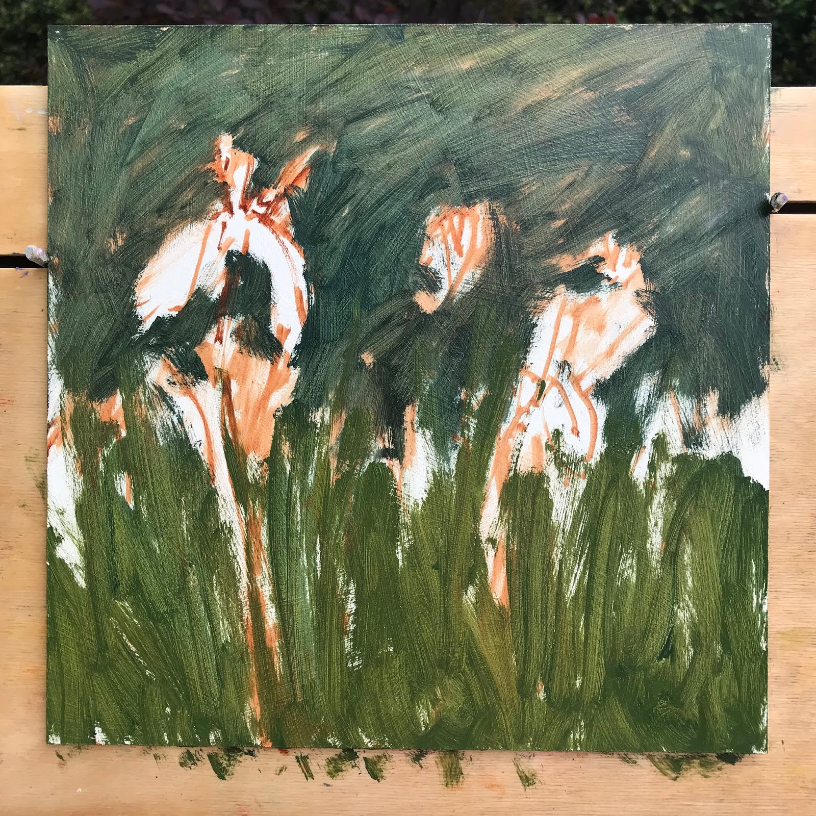
This is how I started, by blocking the two main greens. The tricky part was the tonal values, purple is a naturally dark colour, so you lighten it but it takes away the colour saturation its a fine line to make it all work together.
Here is my tip:
If you are struggling with tonal values in your painting take a photo on your phone of your subject and your painting. Change from colour to black & white this way you can compare the tones to your subject and you painting and see if all the areas are working, and whether it needs to be adjusted, this is early stages:

The colours where ok but the tonal values of the colours too similar.

So I darkened the background and lightened the petals and Iris foliage area.
I also warmed the flower colour to pinky purple which goes better with the green.

Wednesday, 23 May 2018

#334 'Pink Peonies' 10x12"


I have wanted to paint peonies for a while, last year they felt too scary to tackle! So I decided to go for it! I painted outside in natural light, there was no sunshine but it didn't matter. I placed a purple piece of paper under the flowers and decided the green grass was too contrasted in colour so made up the background - which was quite liberating! 
This is the painting blocked in, next to the steps of my studio
I worked on loose, lively brush strokes and keeping the colours fresh, clean and bold! How did I do this? Different brushes for each colour, organised palette - premix colours before painting. Background flat area - brush strokes in different directions and lengths, not smoothing or hiding the marks. I used 'Permanent Rose' for the pinks, mainly with Ultramarine and a little Michael Harding 'Kings Blue deep'.

Wednesday, 25 May 2016

#79 'Gorse Cottages' 8x8"


This house is a few doors away from us. I was drawn to the sun drenched blue pots bursting with flowers. I cropped the door to make it a more interesting composition - and to emphasis the bits I really like! 
I started painting the pots first they were fun to do and reminded me of the still lives I've been painting. The painting indoors has definitely helped my plein air painting.
I worked on matching the front door colour, I kept thinking I'm sure this is a Farrow and Ball tint! 
When I took the painting in I realised I hadn't gone dark enough with the shadows, and would need to go over some of them. If the shadows aren't dark enough there isn't the contrast you get on a bright sunny day. 


Monday, 23 May 2016

#78 'Wisteria' 8x8"

Oil painting of Wisteria flowers in purple and pinks

I experimented with this painting. I used a different board called: Ampersand, it has a super smooth surface, unlike the medium textured board I usually use, which means the paint goes on easily but sometimes slips off and doesnt even make a mark! You have to get the thickness of paint right. I also used a medium called Sansodor, I usually use the oils neat but wanted to try a looser more impressionist feel. 
I painted in the beginning with squinted eyes, to take away the detail and just paint the shapes, it helped. It was hard to get the balance of impressionist and fluid but still convey the shapes of the flowers. I'm pleased with the outcome and will try more in this way. 
This wisteria is outside the front of our house, it great to finally paint it!


Wednesday, 6 April 2016

#57 'Aubergine' 6x6"


This is the second time I have painted an aubergine, the first was back in January. 
I thought it would be a good subject for my students to try as it is very dark in tone but richly coloured and very shiny as well. 
I enjoyed painting it I hope they will too :-)

Thursday, 31 March 2016

#54 'Two Pink Jugs' 6x6"


I finished my colour studies this morning and wanted to use some of the lovely pinks and violets I had mixed. So this is the result of it! I didn't have many pink pots or jugs in my supply so adapted what I had, see photo below to what they really looked like!

They had unusual shaped spouts which made it interesting to paint. I also accenturated the size and shapes of the jugs to make a more pleasing composition. The main colours I used are: Magenta and Ultramarine with a little Cadmium Yellow Pale.


Sunday, 28 February 2016

#41 'Vinaigrette Bottle' 4x6"

With each painting I do I try and challenge myself, whether it is with composition, colour, being outside...today I decided to do my first pattern on my subject. There was a pattern on the bottle but I took it sa a starting point. I painted the pattern first (so there was no going back with putting it in!) See pic below. I did the basic leaf shapes and then at the end painted lines over the leaves to bring them to life. 
It reminds me of Raol Dufy, an artist I studied at art school, he put illustrative lines over colour.
I also was brave with the background colour, using a strong, dark blue-violet, which makes the bottle pop out! I'm happy with how this turned out.

Monday, 15 February 2016

#34 'Lisianthus' 5x7"

These flowers were in my bouquet I had on for Valentines day :-)
I like the wispy delicate buds and rich deep flower heads. I had a go at drawing it before thinking it would work as a coloured drawing. But the colours were so wishy washy compared to oils I had to then have a go at painting it! 
I kept it very simple with the detail of the flowers but emphasising the purple colours and using a light touch with the creamy buds.
Painting beginnings ....

Friday, 12 February 2016

#32 'Large Mint Teapot' 7.5x9.5"

I elevated this teapot to see the squat rounded shape. It was fun to paint, broad painterly brush strokes and the gorgeous mint colour. 
I changed the board 3 times before I was happy with the preliminary drawing. It needed to fit the parameter well. It's on a canvas with a 'ground colour' already applied and dried - see pic below. I will use some more ground colours especially with light subject colours as they really show up well and it brings a unity to the whole as small parts of the ground colour show through.
I went for a strong dark tone of purple for the background, I wanted the lovely shape of the teapot to stand out.
Beginning stages of the painting...

Sunday, 31 January 2016

Daily Painting #24 'Open Iris Flower' 4x4"


My Mum and Dad in law are coming for Sunday lunch. I wanted to get a little painting in before they came and before we started cleaning the house! 
I lit the flower but I ended up turning it off half way through as it made it too complicated with the lights and shadows. I tried not to fuss it too much as there were lots of fiddly bits but so I simplified with strong brush strokes. Maybe it would work on a bigger scale. I will try some other flower heads soon.

Thursday, 28 January 2016

Daily Painting #21 'An Iris Flower' 4x4"

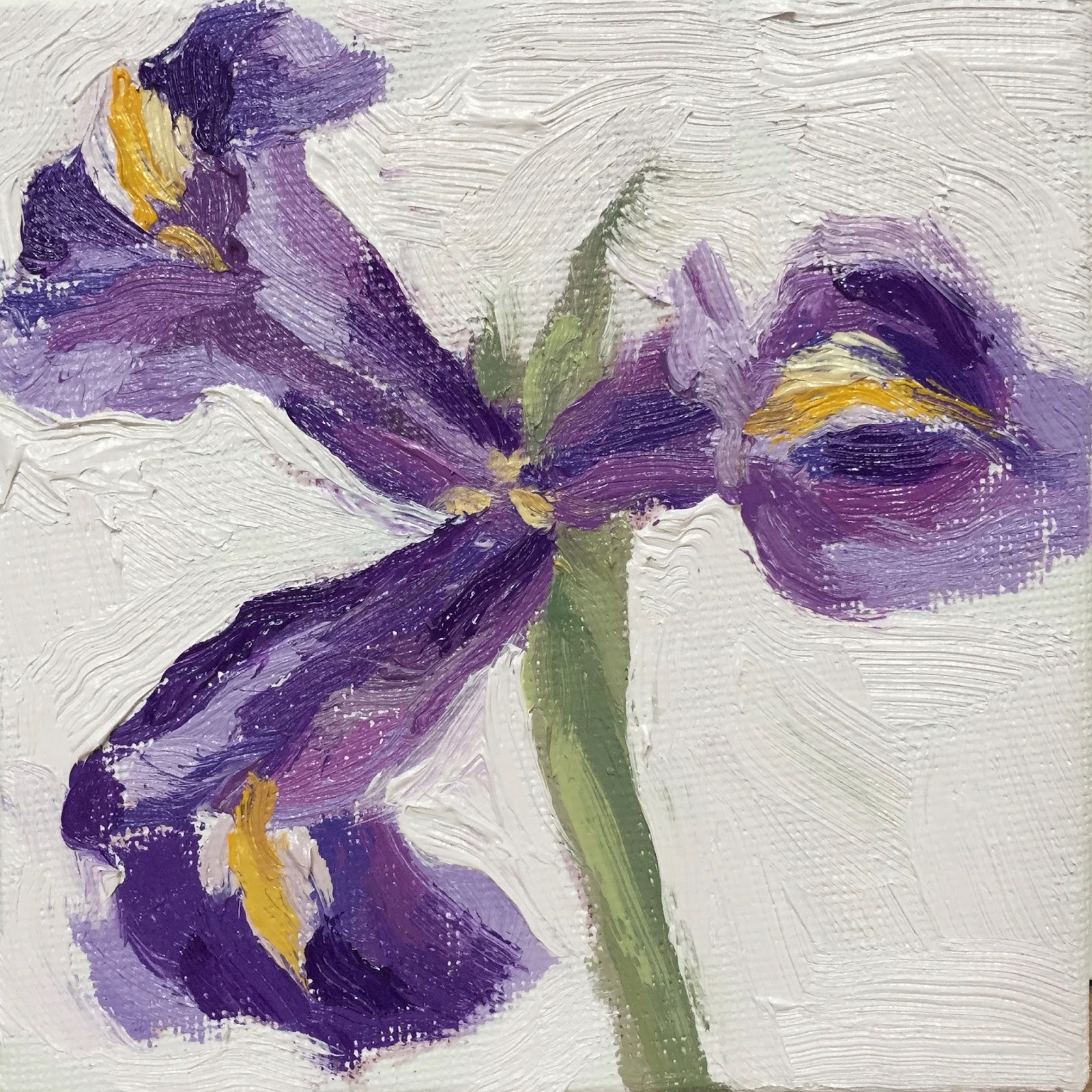
It was good to try the iris again, a close up small painting. Easier to focus on the colours and tones when there is just a single flower. I had 'learnt' the subject yesterday so it was familiar today and therefore a lot easier. I enjoyed using the rich violet colours and dashes of yellow.

Wednesday, 27 January 2016

Daily Painting #20 'Iris Flowers' 10x8"

These flowers took me ages! So much so Matte, my dog asked for food and attention while I was taking the photo of the finished painting, see pic below. 
Tricky subject again, next time I'm doing a simpler one! I thought the Iris flowers looked a bit like butterflies. I struggled with the background colour, I chose a muted yellow and it looked horrid so I scraped off and put on off white, it's better but it looses some of the spontaneity. I haven't really painted a bunch of flowers before, lovely colours and I will do more...

Saturday, 9 January 2016

Daily Painting #8 'Aubergine' 6x8" Oil on Board

The composition was set up with the aubergine and coloured papers, I then moved myself around to find a good viewpoint and height.

I looked through my viewfinder to draw with a paint brush onto the board.

Althought he aubergine is very dark in tone I worked on getting a good tonal range throughout.

It was fun to use a big brush and sweep down the body of the aubergine.