Saturday 31 March 2018

#321 'Early Morning, Chelsea Bridge' 8x10" & The Artist Mind


An artist mind and attitude has so much to do with painting as their body! It can really get in the way sometimes. 
On Thursday I went to London I had prepped a lot the night before to make me feel ready and have some sort of plan. The last time I went to London I didn't prep and my painting was dreadful! So that was in the back of my mind I wanted it to be a positive experience

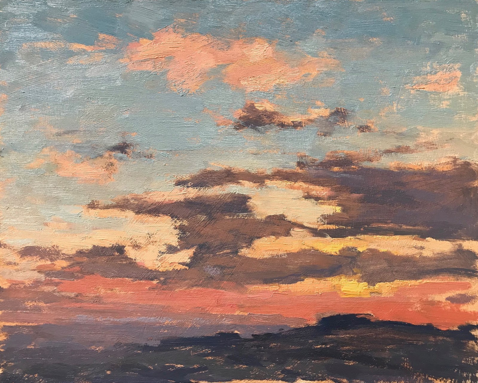
It was absolutely stunning when I arrived at Albert Bridge the sun was just coming up over the Thames River and the light on the water was gorgeous. I was too late to paint it but had to suffice with photos and drinking it up.
I set up contra jour it worked because there was a haze of cloud not too bright in my eyes. Just as I started to apply the paint the sun broke through and dazzled me! So bright off the water I couldn't see the subject (see pic below) so I abandoned this painting - I will have a go at in the studio.

I walked to the other side of the bridge with the sun behind me.A complex view that I couldn't get my head around  (see pic below). My board didn't fit the subject very well so the composition wasn't working and the board was too slippery, these two factors alone through me I wiped off twice and started again. Meanwhile my mind is doubting and panicking ....'I wont have a painting to show for all this effort or I've lost it I can't paint any more!! Quite ridiculous but thats what happens on a hard day.

I turned around and saw the Chelsea Bridge view and thought that's a better subject. It fitted a smaller board and I painted it in less than an hour. My mind was now quiet and happy! Such a rollercoaster. Painting plein air you never know if it will turn out. I think everybody who paints struggles with self doubt and fear of 'failing' It seams however many paintings I get under my belt it still happens, I hope I can work on this!
'The Artist Way' by Julia Cameron is a great book I've had for for years and does focus on the mind and creativity.

Thursday 29 March 2018

#320 'Spring Daffs' 8x8"


Quite fun to choose the colour combinations when you do a still life. I have lots of coloured paper that I try behind my subject to see what works. This dark blue-green paper made the daffodils really pop and also I liked it that it was close in tone and colour to the ceramic vase.
I tried a different method of painting the flowers which was to map out the yellow petals in one tone and get the shapes right. Trying to simplify and not use to many marks to describe the flowers.
The vase has lots of subtle nuances the reflected yellow from the overhanging daff and light bouncing up from the wood sill its sitting on.
The background some areas I left crisp others I softened, which adds variety and interest.
I hope to do this still life again with a lighter background to see the difference.
Here are the main stages...


Wednesday 28 March 2018

#319 'Early Morning on Bramshott Common' 10x12"


I decided this was going to be a more tonal painting less colour more about tonal shapes and brush marks. Leaving some of the board colour showing gives a sense of unity. The foreground trees are on the golden line - where it's the most pleasing to the eye - about a third in.
Location pic showing the layers of tonal colours. I painted this scene first in the snow and will paint it again when the spring greens come :-)

Sunday 25 March 2018

Plein Air Workshop May 2018

Just two places left on this workshop I will be running May 19th in Hampshire. It will be structured teaching and include a handout, short demo, lots of one to one help and plenty of painting! Contact me if you are interested. Clare

Friday 23 March 2018

#318 'Snow Shadows' 9x10"


On the last day of snow the sun came out, I wanted to find shadows and light to paint. I loved these colours. The sun was behind me and close to the tree line, I didn't know how long I had to paint the bit I liked! Usually I would have started on the structure first - the trees. But this time I quickly put the bluey shadows in the and the different colours of snow, it was peachy and warm because of the low sun. See pic below.
One important factor to the composition was the light through the trees contrasting the dark foreground trees and shadows. The distance needed to be bright and light and not very defined. The path is also good for leading the eye through.
Thickness of paint can give emphasis to an area, so the snow is important and also light in tone so it gets a thick application. The foreground trees are darker and thinner in paint as I don't want the eye to linger on this area as long. I did repaint the tree area as it was too thick and it made the area to strong, scraped off redid and much better! I'm not worried to do this in a painting as it can add a depth to it. The blue shadows were applied and left alone no retouching or fussing.
I am happy with this one especially the application of paint.

Wednesday 21 March 2018

#317 'Spring Snow at the Devils Punch Bowl' 8x19.5"


On the first day of snow I tackled this scene in a panoramic format. I went back yesterday - the last day of snow and did it again. This time a lot bigger as I found the small board crampt for the scene, see below:

6x15" initial oil study
The light & shadows came at the end and I happily put them in, I was unsure whether it would work with the painting but it could be a shaft of light between the black clouds!

I emphasised the strong sweeping shape from the bottom left to top right, plus the snow covered path hugging the Punch Bowl in the distance. 
I'm pleased with this painting as its difficult to capture the vast space and essence of the Punch Bowl :-)

Tuesday 20 March 2018

#316 'Tracks Through the Snow 10x12"


I went back to the same area as the previous painting the following morning - you can see the church in the distance, I'm stood further away. I loved the tracks and countryside feel.

Enjoyed the colours of the bushes on the right side and the strong fence line. I try to see colours in darks, just because they are dark in tone doesn't mean they are dull! 
It was a brighter day but still no sunlight. The sky was grey blue and I brought some of that colour down onto the snow as it reflects like water. 
I had painted in the big tree in the distance but decided it was competing with the church for a focal point so took out. I worked hard on getting the elements placed well before I began the painting which usually mean lots of drawing in and wiping it off again, important to start the composition well!

#315 ' Homefield in Snow' 8x14"


Such a wonderful find! A new painting in snow place, looked on the map before leaving and choose this area because of the farm. The church and big tree was a bonus. 
When I arrive there was an amazing stampede of cows running towards me as I entered the field next to them. They screeched to a stop because of the electric fence between us.
All lined up looking and following me as I walked around the field:


I liked the strong horizon line tone & colours, against the light snow and sky.
The sky got better as the sun went lower a lovely apricot colour.
The big tree was tricky as it was so much bigger in scale than the rest of painting but wanted to make it work and fit.

I choose this angle of the view because of the crop field with great leading lines in - how much detail to add, reminded me of a Van Gogh reed drawing all the sticking up crops. I didn't put many in as it looked bitty.
No sunshine so not much tonal difference in the foreground snow.

Photo by husband Nick Oakley, when he saw the above photo of cows he came too take pics of them!

Monday 19 March 2018

#314 'Low Tide Crossing, Bosham' 8x14" & When to Scrap a Painting!


My husband Nick and I went down to Emsworth - Hampshire/West Sussex coast line to paint and photo for a long weekend. This was my first painting from it.

It was a struggle painting and I nearly ditched it 3/4 of the way through. I didn't think it was working and therefore I felt despondent and upset and so couldn't see the wood for the trees! I hate being beaten so I took it back to our place and Nick said it's good! Looking with fresh eyes I realised it was not a disaster!! and actually came out well in the end. 

Lesson: Don't scrap a painting immediately wait as long as you can. If I'm unsure I have them up on my shelf in my studio and after a while and if I still cant bear it I will put them in place where all the others are! I have quite a stack, wether finished or not. At a later date I go through and can see if I can learn from them and how I'd do them differently now, and I can also see the progress I have made with a current comparable painting.

I don't tent to paint over them as I don't like the surface it creates, some artists reuse their boards which can be an economical thing to do.

A thing I learnt from another artist is keep starting paintings it's the way you really learn and improve. The finishing come with time & practise but it's the starting that's the real foundation to your work. So sometimes that's what I say to myself just start this, and usually I can't help but continue!
Heres a pic of how I started this one:
The sky was beautiful so I put it in first and it also helps with the colour fo the mud and water.

Saturday 17 March 2018

#313 'Snowdrops in Ceramic Jug' 8x8" & Viewfinders


Last of the spring flowers for now especially with the snow falling outside! 
These little snowdrops were still good after the previous day painting. I didn't want to repeat the painting so changed from glass to a jug. 
I use a viewfinder for just about all my paintings still life and plein air.
Heres a pic of it:

It helps me to see what's important in my subject, to decide on format - I have a landscape viewfinder too. I also coloured the front and back with different ground colours, see the grey one below:
The colour helps me compare with the subject to my board colour e.g How does the shadow petals of the snowdrop compare to the grey board colour?  
I also check the tones by looking through the little hole and match them to the white and black. Still looking through the hole - compare the colours to different areas of the subject.

Viewfinders are easy to make I used foam board as it's light for carrying around, they are so helpful!

I asked on social media what people thought of the two snowdrops paintings - and the glass vase first one I did came out top which one do you prefer?

Friday 16 March 2018

#312 'Snowdrops' 8x8"


Carrying on with the spring flowers theme this week. I chose a dark background to show them up. It needed to be darker than the darkest tone of the white petals as I didn't want them disappearing too much. 
The little glass vase seamed to mimic their fragility I enjoyed painting it too.

I started as I do in landscape putting the dark shapes in:
It was nice to have the subject close up unlike the landscape which is spread out, so you can really see what's there. 
I will post my last spring flowers tomorrow.

I've heard snow is coming again....how exciting! Although we are just off to Emsworth, Hampshire for a seaside painting/photo weekend, will have to come back if it does snow to paint it!!

Wednesday 14 March 2018

#311 'First Spring Dafodils' 8x8"


I have spent the past 3 days painting in my studio instead of en plein air, a change mainly because it was raining in the beginning of the week and I fancied painting some spring flowers.....
I was given this posy by mother in law for Mothers day. I liked the natural 'gathered from the garden' feel. 
Placed on a shelf just under eye level, a window to the left side, with the light hitting the yellows.
Daffodils are a challenge because of the colour, to get the variety of tones in yellow and the warm and cools of the petals and trumpets. I spent time mixing a range of tones, in cool and warm and mixing a light violet - using Michael Hardings Kings Blue dark, as a complimentary to mute and darken the yellow.
Here is my palette before I began painting...
I think painting from life in the studio is a great help to painting outside as they are both observational but a still life allows more time to mix colours get tones right and the subject not to be constantly changing or be overwhelmed by a big landscape - you choose the size of your still life. 
I thought painting a mass of flowers would be harder than painting just one flower, but actually it isn't, painting a bunch you don't have to paint everything that's there just suggesting overall shapes and colours. So have a go it's fun! :-)

Friday 9 March 2018

#310 'Winter Covers, Bosham Quay' 10x12"


Yesterday was blowing a gale in Bosham Harbour but it was a bright wintery day and of course the best spot to paint was at the windiest point!
I like the bright blue covers of the yachts and the old barn style building - the sailing club. 
A challenge to make the painting work as a whole. So I linked the sky colour to the water and the masts of the boats through the dark of the building. The clouds I made stronge shapes, the blue of the sky was bright and clear. 
The barn was super dark almost black in the shadow part and the light side was tricky to get it dark but showing the light as well. 
The boats were fun to paint emphasising the covers - as it's the bit I liked. The fronts of the boats were in the light and the brightest part of the painting, almost Titanium White with a little yellow added.
The wooden struts of the harbour wall I didn't want to overpaint as they can look stiff, I put them in sweeping strokes and making sure I added the light after to give a sense of sunshine. Leaving some fo the ground showing through to make the painting link together in another way. 
Pleased with how this one turned out when I wasn't sure it would work.
First stages...

Thursday 8 March 2018

#309 'Meon Valley' 9x10"


First visit to paint in the Meon Valley with the Isle of Wight in the distance, a lovely area and will do lots more here.

Surprisingly cold with still some snow on the ground, I was drawn to the rounded shapes of the hills overlapping and skeleton tree shapes of winter. 

Making the tones and intensities of the greens work and keeping the dark trees in the foreground strong. The middle distance I wanted to paint bluer than it was, kept adjusting the colour to a warmer light mix. A little bit of light on the water in the distance. I thinned out the foreground trees as they were too dense and stopping the eye from moving up through the painting. Just off square format to emphasis the rounded hills. 
Pleased with this one, as landscapes are not easy!


Wednesday 7 March 2018

#308 'Sunset over The South Downs' 10x12"


A painting I'd started just as the snowy weather arrived. It was so bitter exposed on the top of the South Downs, but a stunning sunset. I had been painting another but stopped and started this one, which turned out better as the colours are stronger and I honed in to the bit of the hill and sky I liked previous one I tired to put too much of the view in it!

This is where I got to outside (see pic below), the sun quickly disappeared below the horizon which of course changed it so I stopped.
Completed yesterday in my studio.

Tuesday 6 March 2018

#307 'Hammer Vale in Winter' 8x10"


I started this when it was a blizzard, the ice crystals landing on my board and palette congealing into little snow balls! I struggled on but the conditions weren't conducive to say the least! 
I went back the next morning and decided to start afresh, new painting same view. So much easier when the weather is a little less extreme. See pic below.
Ice Crystals!!
I have ended up with two paintings of the same view, the first which I have made my main top one. I scraped off what I did when it was snowing and did a fresh layer of paint over the top in the studio and it ended up better I think than the one below. Which surprised me.

Second attempt painting
So I actually painted this view 3 times - first day in the snow second day not snowing but maybe too careful and the third day in my studio back on the first painting! if you can follow all that :-)

The learning is paint a subject more than once, it really helps to know it, familiarise, relax with it and also not worry about the end result. I thought it wouldn't turn out so I went for it nothing to loose and it worked!

Things I did differently: pushed the tones to lighter, made the colours yellower and bluer - prettier, freer with the brush strokes, emphasised the foreground tree branches...changed the widths of bands of colour.

A couple of people people kindly took photos of me over those couple of days. 
Couldn't have painted without the brolly while it was snowing.

Monday 5 March 2018

#306 'Snow falling on Bramshott Common' 10x10"


I started this by at 8am because I knew the heavy snowfall was due. I have painted this scene before back in 2016 when there was a light dusting and the path still visible. 

The shape of the foreground tree I emphasised with light and dark contrasts, as I liked the shape. Also the path making an 'S' shape into the picture. The line of trees at the back I simplified but I may still re work them. 
Not many colours, quite a tonal painting. The snow I applied the paint thick & juicy especially as it wasn't sticking very well to the board due to the cold atmosphere and snowy conditions. It started to really snow by the end of the panting so I decided to include a few flutters of flakes.
This is half was through...

Saturday 3 March 2018

#305 'Gateway to Bramshott Common' 10x10"


It's been a while since I posted, returning from Devon I painted 3 or 4 that I either haven't finished or don't like! And now the past couple of days I've done 3 snow paintings here's the first.....

Painted this morning I've been waiting eagerly for the snow!! and it's here!
Although this morning was just a dusting but enough to make a painting. I was really pleased to stumble across this view, such a great composition with lots of elements - close foreground interest and distant space.

Walking finding a spot I had in my mind how I wanted to paint - bold brush marks & strong composition. Snow seems to lend itself to this combos, and it helps my confidence to attack it and not be timid with applying paint! Mind plays a big part in the painting process.

I have painted gates before and they can look laboured so I deliberately didn't do much to it, focused more on what was through and behind them. 
The sky is a slightly darker than the snow, the colours in the snow pick up the sky colours.
I painted a web of branches, tree trunk and gate before I added anything else see pic below.


It helps structure the painting with the important parts and then paint around them - easier than painting on top and sits better in the painting.

The M.O.D yellow sign I left till the end unsure as to whether to include it. I did and it actually adds to the painting!