Showing posts with label Red. Show all posts

Thursday, 27 July 2017

#209 'Salva Mea, Whitstable' 18x21cm


The is was the second time for being a guest with the Wapping group (a prestigious group based in London the member are accomplished professional painters.)

Whitstable in Kent is one of the further places they visit. I'd not been before but it had a lot to offer an artist, unfortunately the weather was against with rain and wind. This boat was my second painting attempt of the day - the first was abandoned due to a heavy rain. I stood for a while holding my umbrella - I couldn't attach it to the esael as it was too windy. I tried to paint but the rain was coming underneath! 
So this little red boat was perfect as I could stand in shelter under a oyster cabin. At one point there was 7 of us painting a similar view all huddled in the dry!
I had just started painting and a big fishing boat comes in with all his catch to unload and of course wants access to the door I'm standing in front of! I had a little window to look through see my view here it is: 
People often ask why plein air is harder than painting in the studio, so many reasons!! This is one of them, things change.

I loved the reflection of the boat, worked hard to get the tone and colours right. I did it as a patch work of paint strokes building it up to make a mosaic of colour. I'm pleased with the result. I kept the colours limited for harmony, the main ones being red & green - colour complimentaries. 
The name of the boat Salva Mea means: Save me. 

Monday, 13 June 2016

#83 'Reflected Watermelon' 6x8"

Slice of Watermelon oil painting reflected in a table top

It's been so busy I haven't had the time or energy to do any painting. But I was itching to do one so I got into my studio by 6am this morning which gave me time to focus and work on this painting before any Open Studio visitors arrived at 11am.
I put the melon on tin foil and was pleased with the reflection it created of the skin. 
Painting it I was aiming for the translucency at the top and richness of the red, fun to paint and will have another go. 

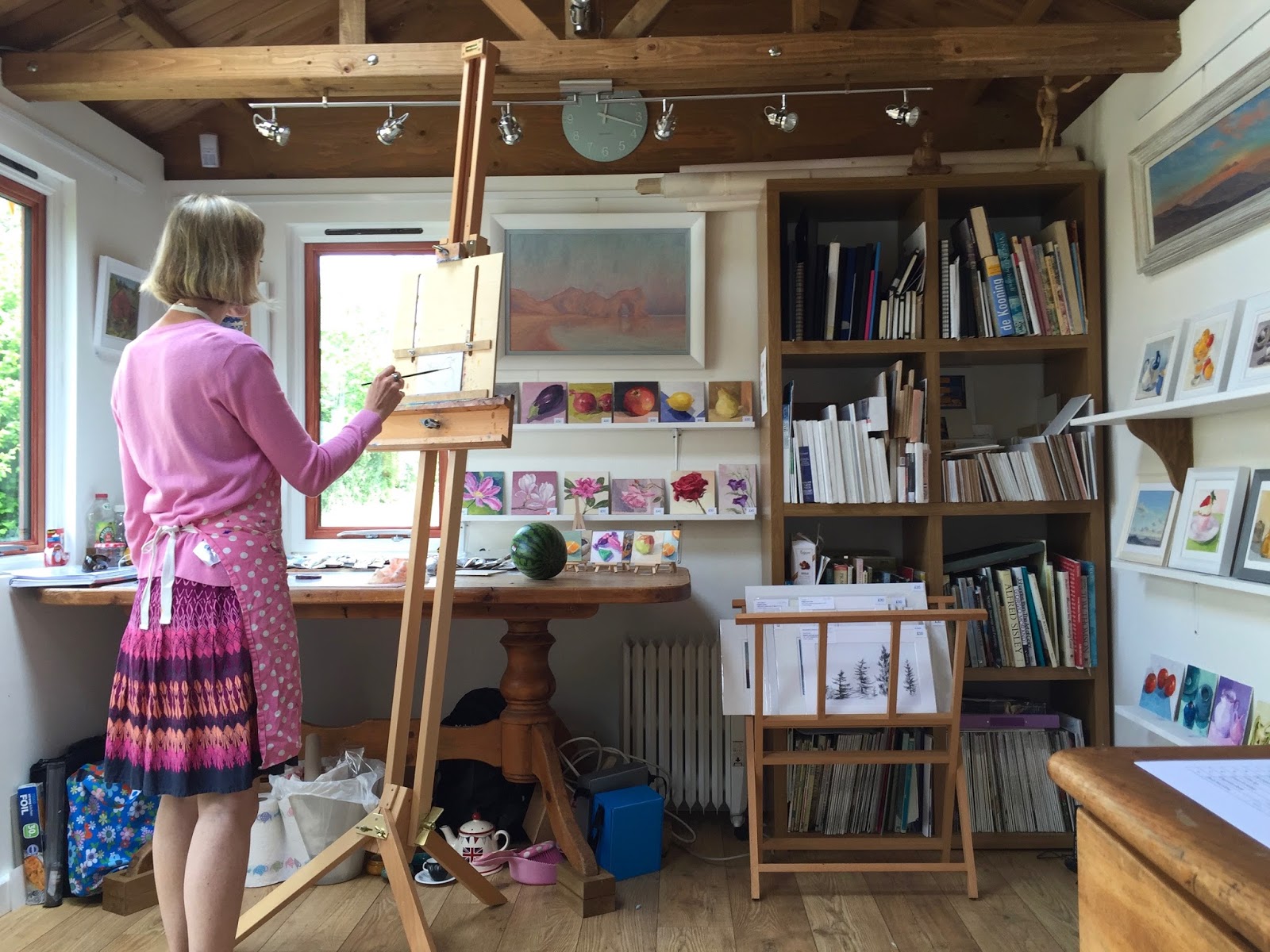
The photo below is of me over the weekend painting in between visitors but didn't get much done so it was abandoned. I'm not complaining about having people come and visit as the Open Studio is going well :-) Making sales each day we are open and meeting some new arty people especially in the local area which is really great.


Monday, 6 June 2016

#82 'A Bowl of Cherries' 6x6"

oil painting of 3 cherries in a turquoise bowl, with scatterd cherries around it

I enjoyed the previous cherry painting so I thought I'd have another go. I haven't done this in the past as I was scared to try and repeat something that was successful but decided to go for it and I'm pleased with the result. Lush colours and shiny cherries!
I chose a range of cherry colours and tones for composition. The little bowl has appeared in 3 paintings now, it's a useful size and favourite colour! The past two were - 'Citrus' & 'Turqoiuse Pots'.
My light box where I usually place my still life set up is dismantled for the Open Studio, therefore it was harder to paint as I had about 5 different light sources, I kept turning off and on my lamp to see its light to paint.
Using my primed boards is a much more slippery surface than I'm used to and although it gives a nice result I'm not used to the slipperiness. For example adding a dark tone over an area I have to lay the brush at a really low angle to the board and load it or else it just takes the paint off underneath. 

The Open Studios went really well at the weekend we had a good number of visitors and I sold 7 paintings, really pleased :-)  I had some great feedback and I enjoyed talking art with people. We are open for another two weekends, looking forward to see what that brings. I will include some pics next post.

Friday, 3 June 2016

#81 'Reflected Cherries' 6x6"

An oil painting of 3 cherries reflected in glass

Loved painting these cherries! So luscious and shiny, I ate some while I was painting too.
I haven't tried using tin foil to reflect a subject before, it's an idea from an excellent daily painter called Carol Marine it works well and adds a challenge and interest while painting it hopefully to the viewer as well.
I didn't use any white in the main of the cherries, which keeps the paint more translucent and shiny looking - like the cherries. The highlight is thick paint and nearly white makes it more shiny too.
Opening our doors tomorrow for the Open Studio, quite nervous for it, painting this helped calm me and good to get back to the painting again.

Thursday, 19 May 2016

#76 'Peppers' 5x7"


I wanted this to be well observed but painterly. Rich complementary colours go well together. One for my students to try :-)
The title I did want to call it was: 'I'll scratch your back if you scratch mine', but it seamed a bit of a mouthful! When I was painting it that's what I thought of with the green pepper stalk resting on the red peppers back...

Thursday, 7 April 2016

#58 'Rose Cupcake' 6x6"


I was given this cute cupcake by Mirabelle Cafe in Haslemere. I painted one of theirs before and thought I'd have another go. 
Some tough elements like getting the swirls of buttercream icing right and the red paper case. The background is often harder than the subject as it has to all work together and hopefully show off the subject even more. I'm pleased with the finished piece.

Tuesday, 5 April 2016

#56 'Courgette & Tomato' 5x7"


I am pleased with the vibrancy of the greens and reds. The colour charts I made last week were helpful in the colour choices and mixing.

This painting is an aid my students when they will tackle a courgette next half term. 
I enjoyed painting the different greens of the planes of the courgette. I also really obsereved the shadow betwen the two vegetables, it has lots of colours and tones. 

Wednesday, 9 March 2016

#45 "Red Onions' 6x6"


This one is for my students and our class next week. We'll be working on Complementary colours of Red-Violet and Yellow-Green they go together well and tone (light & dark) in colour.
I peeled one layer off the onion to revel a shiney richer surface. I like the top and bottom of the onion and they were the fun bits to paint.

I painted a red onion in the beginning of my daily painting no.6 nearly 40 paintings later there is a difference! Painting small and often definitely improves your skills :-) 

Sunday, 14 February 2016

#33 'Happy Valentines Day' 6x6"


I brought this rose for my husband for Valentines Day. It's the first time I have painted a rose, it's not easy but I enjoyed it. Its called a Naomi rose, with soft velvety petals.

I painted it being totally unsure as to how it would turn out, I used lots of rich reds layered wet into wet paint. I'm pleased with my first attempt and look forward to doing more. Possibly soon as I had a pretty bouquet from hubby today :-)

Tuesday, 9 February 2016

#30 'Strawberry Cupcake' 6x6"

I brought this tasty looking cupcake from a local cafe in Haslemere called Mirabelle. 
I've never painted something like this before, and it was a challenge! Getting the detail without loosing the freshness and making the colours work together as a whole. 
I am pleased with the outcome and a bonus I get to eat the cupcake now with a nice cup of tea!
I just wanted to show you my new easel 'small board holder'. It's perfect! My husband has been busy and made this for me. It prevents shadow overhang as you can see the top of the easel and I can get to all of the board without the easel getting in the way.  

Monday, 1 February 2016

Daily Painting #25 'Little Red Teapot' 6x6"

Broad brush strokes on a little pot! I enjoyed painting this, I mixed a few tones of red before I started and then went for it, making every brush stroke count. The red, white and blue combo really zing.
I found this teapot on eBay, I will have to control myself with buying more colours!

Sunday, 24 January 2016

Daily Painting #18 'Little Braeburn' 4x4"

This a the smallest painting I have ever done. And it caused me quite a lot of angst! The aim was to make the brush strokes as loose and confident as I could, without going back and fussing it. The hard bit is to describe the shape and details without loosing the painterly feel. During most of the painting I thought this isn’t working, I'm glad I persisted though as it turned out ok!

Friday, 22 January 2016

Daily Painting #16 'Mixed Baby Peppers' 6x6"

I took an overhead view as I wanted to see the shape of the peppers. I lit it from behind so the shadows were towards me. 
When I first started the daily painting I hadn't really done still lifes before and two elemements I found the hardest were composition and shadows. Today I enjoyed painting the shadows, seeing lots of colours and reflected light from the peppers. 
Before I start to paint I use my viewfinder to look for an interesting compostion. Here is a photograph of what I could see...I muted the yellow background a little as it was too bright and overpowered the little peppers.

Monday, 18 January 2016

Daily Painting #14 'Two Plums and a Saucer' 6x6" Oil on Board


It takes a while to set up a still life I'm happy with, up to about half an hour of changing objects, moving them around, and different eye levels, and then what size and shape board to paint on.

This painting I'm looking down on the subject, which I've not tried before. I enjoy mixing and painting the two different plum colours.

One of the things I'm working on is having a loose and painterly style, which I found harder on this small board of 6x6" something to practise!

Wednesday, 13 January 2016

Daily Painting #11 'Vine Tomatoes' 6x8" Oil on Board


Up until yesterday I haven't painted tomotoes before and they are suprisingly satisfying to paint! I also havent really used red and it's a fun colour to work with, so rich and strong.

I mixed lots of warm red colours from yellow to burnt orange and deep crimson, I thought I may have put too many into the painting but when I finished the tomotoes off with there stalks and highlights they came together :-)

The turquiose blue (blue-green) is the complementary of red-orange, which makes the colours zing together.

Tuesday, 12 January 2016

Daily Painting #10 'Tomato' 6x6" Oil on Board


I have been teaching Oil Painting this morning, so it was good to be able to start and finish a painting in the afternoon!
My husband and I built a Light Box (Similar to Carol Marines Shadowbox) which is to display my still life objects within. I can control the light source and height. See picture. I used it for the first time today :-) It worked well, with a few tweeks I'm sure it will help with my painting.
A little painting of a tomato, I wanted the colours to be rich and complementary - reds and greens and a simple composition.
I'm going to try another one tomorrow...


Monday, 11 January 2016

Daily Painting #9 'Poinsettia' 7x7" Oil on Paper

I used lots of sweeping brushstrokes and rythmical marks.

Lovely leaves to paint, I kept it very loose and free.

I didn't use much white in the red leaves (as they'd go pink!) Instead I mixed the red with yellow to lighten it and keep it vibrant.