Friday, 8 June 2018

#340 'Boats by Albert Bridge' 10x12"


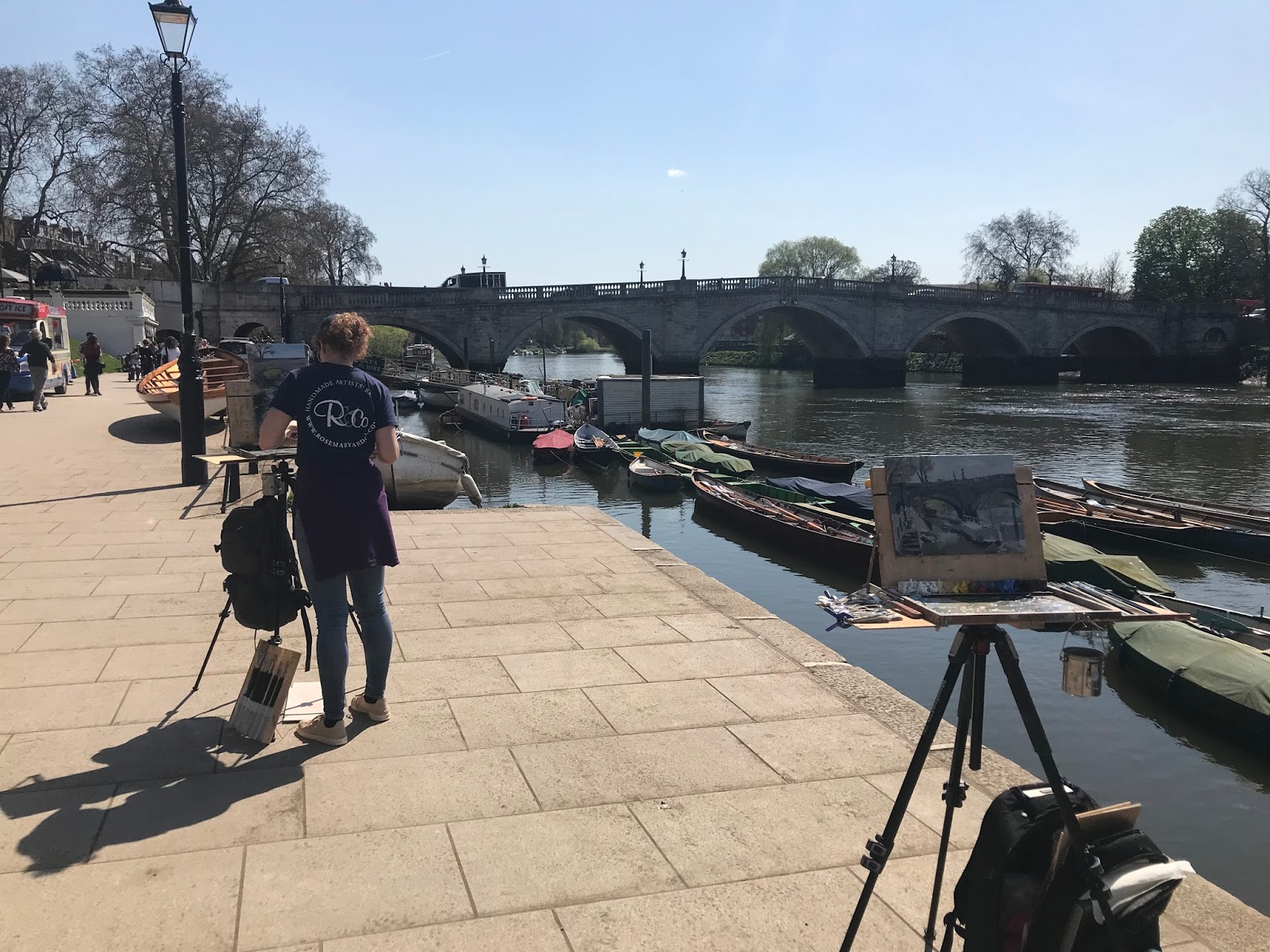
A one to one plein air teaching day with Christopher Michael, choose Albert Bridge area and we were lucky with lots of sunshine!

I helped Christopher with the practicalities of working outside, equipment, layout of paint and using a viewfinder and then tonal values and not including everything you see in your painting! Less is more.

For myself I am always looking to improve my work and move forward so this day I worked on richer colours, strong and painterly brush strokes. I assessed the painting back in the studio and decided not to work on it any more, leave it as an impression rather than an anatomical painting of boats and the bridge.
I'm pleased with the outcome!

Our Open Studios continue today, Saturday and Sunday, if your free come see my previous post for invite come by and say hello :-)

Thursday, 7 June 2018

#339 'White Peonies' 11x14"


I saw these lovely white peonies in the supermarket, a sweet scent and blousie look. 
I managed to paint them while our Open Studio was on last weekend. Quite a challenge to get the tones and colours right. The tonal scale in the flower is so small e.g. Light to very light! They are good practise to really observe. Also the jug is tonal shapes put together! 

There are lots of lovely daisies growing wild near us, I hope to be able to paint them before they disappear... 

Sunday, 3 June 2018

#338 'Peonies' 12x12" & Open Studio Video


Painted with haste and gusto! The background a blue black to set of the light pink flowers peonies which are so fun to paint, quite addictive! (There will be more :-) I think they are a good subject because of the globe shape so you get great light and dark on them. I made use of the thick and thin qualities of oil paint, especially in the green foliage and the table.

Yesterday was our first day of The Surrey Open Studio always with trepidation I open the doors to the public not knowing who will come and what they will think, say or even buy.
But it went well we had some nice people visit, chatted, offered my homemade shortbread and sold 4 originals and some cards so a good start!

Here are a couple of pics and a short video as a taster of what's here.


Friday, 1 June 2018

#337 'Dune' 12x16" & Surrey Open Studios!


My first attempt at a portrait!! I haven't even tried to paint one in my studio, just felt quite scary and uncertain, so went on a ROI painting day at The Mall Galleries to make me do it! 

I decided to act as if.... pretend I felt confident even though I didn't and put the paint down in strong marks and leave them.
I had dipped into an excellent little book before I went called 'Starting to Paint Portraits' by Barnard Dunstan. Its really useful and written in a friendly old fashioned manor.

I premixed my colours before I started like I'd do a plein air landscape. Having a bigger board means the head isn't too small or fiddly, a large area to cover though!

I started with her hair the darkest area, Ultramarine & Burnt Sienna, warmer and cooler patches through it. Then the most intense area - her cheek. I worked outwards from there comparing areas to the intensity and tone of her cheek. 
I put the background next to her skin as soon as I could as its a large area and didn't want to leave it till the last!

I am happy with the result and its encouraged me to try more :-)


You are invited to our Open Studios based in Haslemere Surrey UK. 
If you follow me on here you will know I have a lot of new paintings! Over a 100 to show, so if you are local and have the time it would be great to see you!


Tuesday, 29 May 2018

#336 'Purple Iris' 10x10" & Tonal Value Tip


Painting these flowers in a friends garden was a fine way to spend a bank holiday Monday! 
When I began this painting I had no idea whether it would work as I wasn't sure how to tackle it. 

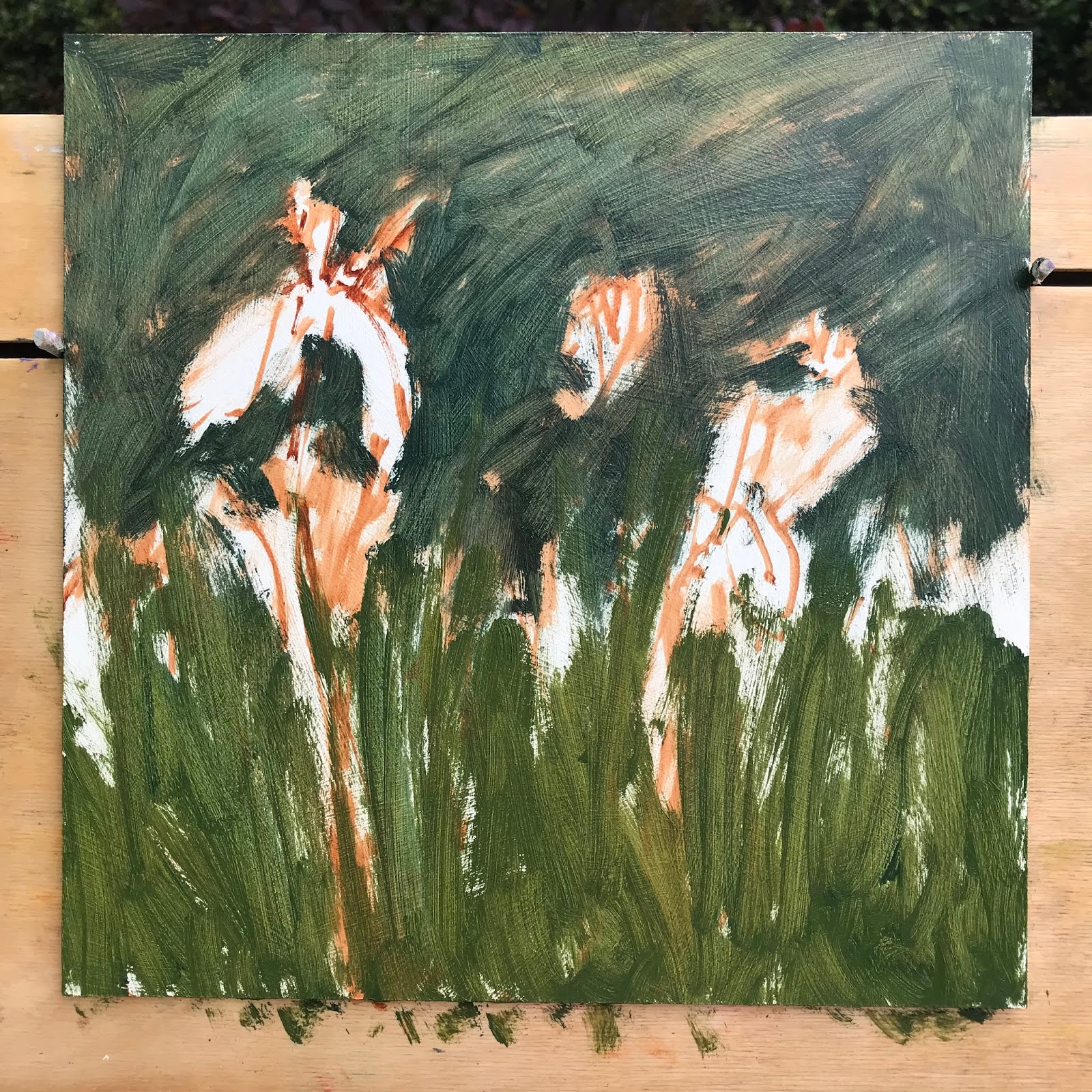
This is how I started, by blocking the two main greens. The tricky part was the tonal values, purple is a naturally dark colour, so you lighten it but it takes away the colour saturation its a fine line to make it all work together.
Here is my tip:
If you are struggling with tonal values in your painting take a photo on your phone of your subject and your painting. Change from colour to black & white this way you can compare the tones to your subject and you painting and see if all the areas are working, and whether it needs to be adjusted, this is early stages:

The colours where ok but the tonal values of the colours too similar.

So I darkened the background and lightened the petals and Iris foliage area.
I also warmed the flower colour to pinky purple which goes better with the green.

Friday, 25 May 2018

#335 'The South Downs' 30x50cm


I went back to the same area as last weeks painting. I wanted to do it again and really study the tonal values and colours. I am pleased with how it turned out.

I will be using this painting for an article I am writing to go into The Artist Magazine. The title of the piece is 'Colour & Aerial Perspective', it will be in the January 2019 edition. I have subscribed to the Artist Magazine on and off since way back in the 80's & 90's so I I am very pleased to fulfil a wish of writing and being in the Magazine :-) 

Back to the subject:
I really like this area to paint, The Trundle, South Downs and have done quite a few now so I want to push myself and try a bigger painting. I brought a 120cmx50cm canvas, it arrived and its huge!! I was tempted to go outside and try it, but I am not set up for such a big support on my easel. So I will prepare as much as I can with drawings and plein air studies and have ago in the studio and let you know how it works out!

I was standing right next to a bush covered in white flowers, there were bugs galore - spot the bee flying past in the photo!

Wednesday, 23 May 2018

#334 'Pink Peonies' 10x12"


I have wanted to paint peonies for a while, last year they felt too scary to tackle! So I decided to go for it! I painted outside in natural light, there was no sunshine but it didn't matter. I placed a purple piece of paper under the flowers and decided the green grass was too contrasted in colour so made up the background - which was quite liberating! 
This is the painting blocked in, next to the steps of my studio
I worked on loose, lively brush strokes and keeping the colours fresh, clean and bold! How did I do this? Different brushes for each colour, organised palette - premix colours before painting. Background flat area - brush strokes in different directions and lengths, not smoothing or hiding the marks. I used 'Permanent Rose' for the pinks, mainly with Ultramarine and a little Michael Harding 'Kings Blue deep'.

Monday, 21 May 2018

#333 'Morning Meadow' 8x10"


We looked out the window and saw gorgeous morning light so dashed down to the end of the garden. My husband hopped over into the field and being a photographer lapped it up. But the camera wasn't enough for me so I grabbed my plein air gear out of the studio and started painting in my pink wellies and PJ's! Yes, a sight but I didn't want to waste any time getting changed.

I tried the option of not pre-staining the board with my usual Burnt Sienna and Ultramarine warm grey colour but using a Burnt Sienna underpainting instead as my base. It's surprising how different it feels and lot lighter in tone, so I will try more of these.

I also was focusing on limited brush strokes. What you put down counts. So its a quick and immediate response to light.
Burnt Sienna Underpainting
Our garden backing onto the field

Sunday, 20 May 2018

#332 'Trundle Path' 8x10"


Second painting of the day on the 1:1 plein air day last week. As you can see it was overcast but still pleasing to paint - the greens, shapes and path... It was a quick study getting the essence fo the place.
I'm using more earth colours - Burnt Sienna and Yellow Ochre as my underpainting base which especially works with the complimentary greens over the top.

Our pochades & paintings
It's quite sketchy my painting so I may tart it a little, I will see if I can live with it first!

Saturday, 19 May 2018

#331 'Early Summer, The South Downs' 9x19"


I held a 1:1 plein air painting day with an artist called Rosie Copeland. Typical it was a windy grey day but actually was easier as it was stable light, so we weren't chasing shadows or squinting into the sun.

We covered a lot of ground from boards, gesso, equipment, my painting colours, colour mixing...viewfinder. Rosie really liked my viewfinder as I'd made a small hole so you can isolate colours and compare them to others in your scene. 

We painted next to each other and she did a cracker painting, mine not so good! - See below:
I got the painting home and wiped it back (below pic) straight away so it didn't dry. The colour was left but no form, I repainted it the next day while it was fresh in my mind, helped I'd already done the same scene last August.
There is too much foreground so I shifted it all down and increased the scale up a bit and reinstated the shapes over the top....

Friday, 11 May 2018

#330 'Sunrise, Bosham Hoe' 30x40cm


A quick sunrise painting of Bosham on a largish canvas. Getting the essence of the scene, brush marks still visible, did this in a hour. It was a beautiful morning, so still and glass like refections.
Tricky to paint as there was an ethereal quality to it, sort of thing I'd like to have another go at straight away!

Here are the beginnings, just blocking in shapes for the buildings, and then picking out lights and darks and roof line.
Painting the sky at the same time as the water, to get the mirror reflection effect.

Wednesday, 9 May 2018

#329 'May Day, Richmond Bridge' 8x19"


The sun was shining and the masses were out! Absolutely heaving for bodies - I painted the people before it got to busy.
It's a bigger scene than I'd usually tackle so I'm pleased it worked out, 

I was about 15 minutes through when people started gathering near me, I realised they were in a queue for a boat ride, the line snaked right next to me, I couldn't even step back to see my painting! Quite unnerving having people watch the process from so close up! See pic below...

To start I put the bridge in roughly making sure I got the shapes of the arches right and then I put the greens next to it, I used a scrubby hog hair brush which lends itself to foliage. 
Water was bold brush strokes using a filbert hog hair and quite loaded with paint, getting similar blues to the sky but darker tone and dirtier colour.
The people I squinted my eyes and looked at the tonal shapes of them first and then added colour and any light on the top.
This pic shows my palette and how busy it got ...

Tuesday, 8 May 2018

#328 'Bosham Quay' 9x12"


I haven't painted in while because my lovely Mum in Law died last week, it wasn't expected and very sad.

I am now back to work and this weather has been glorious for plein air allbeit a little hot!
I timed it just right for this contra jour - sparkle on water - tonal painting.

The tide went lower and the reflections on the posts disappeared before I could put them in. Luckily I was there long enough for the tide to come back up and I could paint them!

Also the light moved really quickly off the water and wet mud, it was very light in tone just warmed a little with Naples Yellow.

Because the yacht is silhouetted in the strong morning sun it is quite dark in tone even though it's a white hulled boat! 

The people in the boat moved around a lot but stayed sitting for enough time to capture them. I didn't want them too pronounced so they come out of the shadows.
The jaunty lean to the boat helps with the composition.

A local chap asked to see my painting when it was 3/4 finished, he said he really liked it and ended up buying it almost off the easel - I wanted to finish it first and let it dry a little :-) 
A great start back to painting...


Thursday, 26 April 2018

#327 'Slipper Mill Pond' 8x10"


I drove past this scene and thought it looked good but still went to 3 other places first thinking I could find better! I had seen this subject in the winter and thought it had promise, but its even better now with the spring foliage. 

Getting a good composition meant I was standing on the side of the road right next to the water. The swans kept looking up at me thinking of was going to feed them especially when I was bending down to pick up a paint brush - not bread!

I like the little house in the distance gives it scale and looking through the negative space between the foreground tree and house.
Tricky weather, April showers - heavy ones, had me rushing for cover, wish I had brought my brolly. 
Will return to do a bigger painting here....

Sunday, 22 April 2018

#326 'Footbridge to Eel Pie Island' 9x12"


An early start up to Twickenham on Friday morning. I wanting to make the most of this glorious weather, although standing in full sun was quite hard work! 

I painted at Twickenham last July with the Wapping Group it was my first time with them as I was nervous I chose a simple subject:
In comparison this painting is quite complex! You can spot the foot bridge in both. 

I have been painting for 2 years en plein air now and I do feel more confident and so able to choose 'harder' more complex subjects. Also being able to complete it on site in a time that works for the changing light. This one took 2 hours. 

I was on a busy through fare with so many distractions its hard to keep focused for example there were very noisy geese fighting over bread tit bits & delivery drivers reversing inches away from me - I must have been painting on the spot! 
Also when you are out there you are game for the publics point of view. Usually people are so kind, friendly and considerate but occasionally you get a plonker who thinks they know better and has to give their opinion, I had one that day and it did rattle me a little. 
The light had moved around, so the bridge wasn't lit by the end of the painting.
I loved the light on the water, the sweepy blue bridge and boats in the shadows. A restful scene that I will revisit.

Saturday, 21 April 2018

#325 'Daffodils & Narcissi' 8x14"


On Thursday this week I was part of a demo evening with Haslemere Art Society. There were 3 artists including me showing how we work, our process from start to finish.

I decided to paint something from life as I find it more inspiring than a photo. I was a bit worried the daffodils would be over but my husband had thankfully planted 500 bulbs so there was a range in our garden to choose from. (I had also spotted a lovely orange centred narcissi in the neighbours garden, I hope he didn't miss the one I nabbed - all in the name of art of course!)

Before everyone turned up I played around with the background colour, I wanted blue as it looked like the sky, I opted for this deeper blue so it made the light flowers stand out. I also lit the flowers from the side as the same height. 

I was quite nervous before it began unsure as to whether I could 'perform' in front of a crowd. I also wanted to be able to talk while I was painting, which I managed to do and even did a bit of teaching too! People were really kind and interested, I enjoyed it and was relieved my painting came out nicely. To have had a flop in front of others would have been tough!
I premixed the main colours as I do in plein air and built up the painting with a series of patchwork brush strokes, not spending too long in one area. 

One of my previous students Dawn kindly took some pics of me here are a couple:


Thursday, 19 April 2018

#324 'Spring at Richmond Bridge' 9x12"


I have been visiting my sister in South Africa a hard decision not to take my paints but lovely to have family time and a break. So I'm fresh and ready to go and what a day to start back...

Painted this yesterday in glorious spring weather.  So warm it felt like summer, I'd forgotten what it's like painting in the heat! Not complaining though.

Quite a complex subject so kept it loose without succumbing to too much detail. Its a great area to paint, so much fodder! 
The bridge was tricky as it was medium light tone but it was contra jour so it was silhouetted and darker than you think. I kept telling myself paint what you see not what you think it looks like!
I was painting with artist buddy Sarah Manolescue she did the same scene but so different, - portrait format ...always fun to see how others interpret the same subject.
It was buzzing around the Thames, with buskers and boaters and people in enjoying the weather, so lovely to have a job outside when it's like this :-)

Spot my easel and Sarah painting near the busker! Plus it felt like we had an audience - so busy!

Wednesday, 11 April 2018

New English Art Club 2018

'Silver Birch in Snow'  8x10"
I have just found out that this painting has been selected for the New English Art Club annual exhibition. I am so pleased as it's a really competitive show to get into and this is the first time I have done it!! 

The exhibition runs: 15-23rd June at The Mall Galleries, London

Some stats: 1500 paintings were entered online & 104 have got in, that's less than 10% 
I had 4 selected which got through the first round:
It's hard to know why the 'Silver Birch in Snow' painting got through and the others didn't get chosen. 
I also went to the best framers I could, they are called 'The Artistic Framing Co' in Hampshire UK. Hand painted frames with silver or gold gilding, not cheap but decided I wanted to give the paintings my best chance!

I have just looked back at the timings of this painting back in mid December. It was one where I walked around a lot trying to find that 'perfect view' but came back to the first view I'd seen! Therefore had very little time before the sun went behind the tree line. The painting only took me 40 minutes!! Funny how your perceptions of making a 'great painting' takes time but especially in plein air sometimes it's quite the opposite.

Friday, 6 April 2018

#323 'Sunrise over Albert Bridge' 11x14"


I saw this scene last week on the Thames, it was quite magical!  But I couldn't paint in plein air as the sun was too bright off the water - I couldn't see the subject!
I did start a painting see below but when I went to work on it in the studio realised I was trying to get too big a picture in so I honed into the bit I really liked, not worrying that I cut off some of the bridge, just making sure the composition worked. 


Also using  a bigger board size than normal, which I enjoyed and worked well for the subject. I used larger brushes for as long as I could mapping in the darks. I graduated the tones from very dark of the boats, making it light as I went to the bridge, trees, background buildings... this gives a sense of space. Also as I lightened mixing the orange sky colour with the dark colour gives a feeling of light saturation - see the tall tower next to the dark bridge strutts.
The 'wires' on the bridge I put a main thicker one in first before the sky and other others after. Being bold with the strokes but a light touch as well - I use a Rosemary & Co Rigger. Where the sun was shining you couldn't see the wires so I didn't paint them in.
The boats needed surprisingly little painting, I put the main shapes to start in a thinned dark and then picked up the light on the top using a mid grey and nearer the sun a warm colour.
I'm really pleased with how this one has turned out.

Monday, 2 April 2018

#322 'Mixed Daffs' 8x8"

I wanted another bash at these flowers with a lighter background and in a glass vase. I choose this green as I thought it looked a bit like grass colour! 

Wishing you all a Happy Easter and heres to more spring like weather :-)