My Husband Nick and I did the Surrey Open Studios for the first time last year. I opened my studio in the garden and his man-shed converts into a photographic studio gallery. (see pic below)
We are doing it again this year and it starts a week today! June 4th at 11am.
I had forgotten how much input it takes to make it work well. I'm just having the framing done and getting my new work made into greeting cards.
I'm excited to show my new work in person to people and not just on the internet. I had 35 paintings last year which was a culmination of 3 years work, I was proud of that amount and the work. This year I just completed my 80th painting! I can't believe I have painted that many in only 5 months. They are of course smaller than my old ones but still pleasing.
I am framing some of them to give an idea of how they will look framed. My husband has built shelves in my studio so the paintings work well propped up and displayed - see pic.
This year we are open for 8 days out of the 16. I already have butterflies for it. I can't wait to have people come and look and chat to them. I like the fact you get to talk to so many lovely people about painting!
I will be carrying on with my 'almost daily painting' while it's on. I'm not sure how much work I'll get done but it's good to keep it going for me and so I can show how how I do it :-)
All the paintings I have done this year will be on sale ranging from £35 - £120. If you have liked a painting you've seen but can't make it here, contact me and we can make a sale through paypal.
I know a lot of you don't live close enough to come and visit us over this time, but if you do you would be very welcome. If not I will be posting updates on how it's going.
Below is an invite we made for it....
Saturday, 28 May 2016
Friday, 27 May 2016
#80 'Clematis' 6x6"
One thing I've learnt with flowers is when you go darker in tonal value the colour become stronger, more intense. Instead of the tones becoming more subdued in colour.
Getting the sunlight look helped with putting the light pink around the edges of the petals. It also made it stand out more against the background.
The background was an experiment. One of my students said this week so you've got to be brave when painting, yes! Sometimes you put a tone or colour on and it scares you :-) being so bright or dark. That happened today with the dark blue but it works and I'm happy!
Wednesday, 25 May 2016
#79 'Gorse Cottages' 8x8"
This house is a few doors away from us. I was drawn to the sun drenched blue pots bursting with flowers. I cropped the door to make it a more interesting composition - and to emphasis the bits I really like!
I started painting the pots first they were fun to do and reminded me of the still lives I've been painting. The painting indoors has definitely helped my plein air painting.
I worked on matching the front door colour, I kept thinking I'm sure this is a Farrow and Ball tint!
When I took the painting in I realised I hadn't gone dark enough with the shadows, and would need to go over some of them. If the shadows aren't dark enough there isn't the contrast you get on a bright sunny day.
Monday, 23 May 2016
#78 'Wisteria' 8x8"
I experimented with this painting. I used a different board called: Ampersand, it has a super smooth surface, unlike the medium textured board I usually use, which means the paint goes on easily but sometimes slips off and doesnt even make a mark! You have to get the thickness of paint right. I also used a medium called Sansodor, I usually use the oils neat but wanted to try a looser more impressionist feel.
I painted in the beginning with squinted eyes, to take away the detail and just paint the shapes, it helped. It was hard to get the balance of impressionist and fluid but still convey the shapes of the flowers. I'm pleased with the outcome and will try more in this way.
This wisteria is outside the front of our house, it great to finally paint it!
Sunday, 22 May 2016
#77 'Citrus' 6x8"
I enjoyed painting these colours, fresh and clean. I liked the shadows - so much in them, also the harmony of colours and the challenge of a cut in half fruit, first one I've tackled! You have to really question what colour is that? And also tone, yellow is tricky as you tend to paint it too light. So I make sure the darks are dark enough without being dirty.
I also made sure my edges were varied with some soft and some crisp. I liked encorporating a bowl with the fruit, fun to paint. I hope my students will enjoy this too :-)
I put this painting up against one I did in January, no.7 quite a different!
![]() |
| No. 77 & No. 7 |
Thursday, 19 May 2016
#76 'Peppers' 5x7"
The title I did want to call it was: 'I'll scratch your back if you scratch mine', but it seamed a bit of a mouthful! When I was painting it that's what I thought of with the green pepper stalk resting on the red peppers back...
Wednesday, 18 May 2016
#75 'Morning Shadows' 8x8"
Being inspired by the weekend workshop, this was an early morning painting in a allotment. I've not been to an allotment before and it was quite lovely, especially at this time of the year. It was huge with over 100 plots based in Compton, Surrey. Sadly it was locked when I got there, not realising this was the case but thankfully one person came and opened up.
It was peaceful standing painting with the sunshine on my back and the birds tweeting! Being caught up in the moment I didn't realise the guy had left and locked me in, oops! But again I was lucky as I finished someone else came and I was free :-)
I'm happy with the painting, quite a complex setting, the shadow shapes on the shed attracted me and the bright sunshine lighting the pots.
Tuesday, 17 May 2016
#74 Tide Coming In' 7x9.5"
This painting I did on the second day of the weekend workshop I just did in Harwich. I was working on shapes and being looser with my mark making.
The tide was coming in very quickly, I had to move all my gear up the beach several times as the water was lapping at my feet!
As the tide came in the boat ungrounded itself and drifted around, not helpful but I had thankfully got most if it in by then.
It was bitter cold with a north wind coming off the sea. See photo below :-) I completed the painting in an hour and forty minutes, a lot faster than usual, helpful when its cold!
I am pleased with the outcome being a zoomed in composition and strong shapes, I probably would have had all the boat in before, so it's great to have influence from another artist.
Monday, 16 May 2016
#73 'Pink Rose' 5x7"
Haidee-Jo Summers ran the workshop, she is a wonderful plein air painter, I feel very inspired and full of new ideas.
This rose was in front of a cottage window, the sun hit the tops of the petals. It was quite tricky to get the richeness of colours but the density of tone as well. Even so I enjoyed it and looking forward to doing more :-)
Wednesday, 11 May 2016
#72 'Teetering' 6x6"
It was a late finish for this painting today as I went to the framers to start framing some of my work ready for the Surrey Open Studios starting June 4th (not long!)
I am pleased with how this one turned out, I wanted to try painting glass and I saw the yellow and red tomatoes in the supermarket and thought they'd fit nicely in the glass dish.
I worked on getting the richness of the colours but making them dark enough in the shadows areas. I hardly used any white for the tomatoes, which keeps the vibrancy.
The glass was interesting, deciding what colour it is and how it distorts the shapes and colours when looking through it.
I am going on a Plein Air Painting Workshop this weekend by the sea, which I'm very excited for, not done one before. It's with an artist I admire Haidee-Jo Summers, lets hope the weather holds and it's an inspiring weekend.
I'm not sure if I will be posting while away but I will try.
Sunday, 8 May 2016
#71 'Sunrise, Frensham Little Pond' 7x9.5"
I am pleased with the reflections, I painted it all in downward soft strokes. The sky I mixed with medium to make it thin and wispy looking. Getting up so early was worth it!
Saturday, 7 May 2016
#70 'The Boathouse, Winkworth Arboretum ' 7x9.5"
I'm not complaining but gosh it was hot out there today! A great spot next to the lake with the geese were really going for it with their honking!
To get the best view of the boathouse I was quite far away from it see pic below, I put the surrounding trees in to get a feel of Winkworth. I enjoyed the spring colours of the leaves.
The water was a challenge, I'm pleased with the sky reflecting ripples. This was my most complex and biggest outside painting to date, progress!
Wednesday, 4 May 2016
#69 'Garlic Bulbs' 5x7"
I painted in a really dark background mixing a blue-black and brown-black with the 3 primary colours. It felt quite scary putting such dark colours next to the light garlic but it works! And my students will be trying this as well next week :-)
Started on a coloured ground and put all the light tones in first.
Monday, 2 May 2016
#68 'Little China Clog' 6x6"
I started out with three pieces in the composition, but changed it as I wanted the clog to be the star.
I'm pleased with the blue flower pattern, I left some orange of the ground colour showing it seamed to work better than just blue and white.
The little clog is only a few inches long, but it was fun to paint, another gem from a charity shop.
I thought you may like to see inside my studio cupboard it's my still life collection from charity shops & eBay brought over the past few months - this isn't all of it either!!
It helps to have a good range as like today I had no clue as to what I was going to paint until I delved into the cupboard :-) (Spot where the little clog is.)
Saturday, 30 April 2016
'Yachts, Port Solent' Pen & Ink
I wasn't up to painting it but hopefully will get back there and do it another day.
Friday, 29 April 2016
#67 'Quality Street' 4x4"
I have been poorly this week (with a nasty cough) , so I was only up to doing a small painting today.
These chocolates were surpringsly tricky to paint. The colours are quite intense, I used my artifical colours like Pathalo Blue & Green and Magenta. Lots of reflective surfaces with highlights and shine. Many colours are in the shadows too. I did paint the background a pale pink but change it as the chocs disappeared, the whiter background makes them pop out.
The chocolates are: The Purple One (Hazelnut & Caramel), Green Triangle (Noisette Pate),
Vanilla Fudge.
Tuesday, 26 April 2016
'Skies 1 & 2' Pastel on paper, 10x15" & 8x10"
Gorgeous sky again had to draw it. I haven't really used pastels much before, so I experimenting with what they can do. I need to invest in some more colours and surfaces. I had a look online and got rather overwhelmed with the 400 colours I could choose from in just one make!
Also the surfaces, this one is with a sandpaper style rough textured like sandpaper, great for pastels as they stick to the paper nicely.
I kept it quite loose in the marks and not putting much detail in. A couple of colours I overlaid with another but mostly it's one layer. I also let some of the brown paper show through to add unity to the whole - like an oil painting.
Monday, 25 April 2016
'The River Wey, Guildford' Pen & Ink
Interesting view of the navy blue narrow boat and behind it were two barns, the larger one was called 'Dapdune Warf' a busy boating area and good for a riverside stroll.
Saturday, 23 April 2016
#66 'Magnolia' 6x6"
Broad strokes were used with not too much fussy detail. The tonal differences were very small, I did light the flowers from the side to create more shadows and interest.
I decided to paint over the top of the dusty pink ground in a similar but lighter colour graduating it as I went up the board also leaving gaps so the base colour shows through and links it together.
Friday, 22 April 2016
#65 'Rhododendron' 6x6"
A tricky subject! Painting the flowers so they are defined but not overworked. Simplyfing the pink tones and shapes otherwise its confusing to the eye.
I did paint in a blue background thinking it's like the sky, but it looked dreadful! It's now a creamy pink colour (the camera doesn't pick it up)
I worked on the edges so they were soft, flowers are delicate so a crisp line makes them look cut out and not sit in the painting.
I had trouble getting the cutting to stand up in the glass, bluetack on the bottom, masking tape the leaf to the glass, all didnt work...in the end I raided my husbands garden sand but didn't realise Rhodies have a short life, I should have put water in the glass as well as sand! It wilted before I finished :-(
Anyway I'm pleased with the result, and will try some more flowers...
I did paint in a blue background thinking it's like the sky, but it looked dreadful! It's now a creamy pink colour (the camera doesn't pick it up)
I worked on the edges so they were soft, flowers are delicate so a crisp line makes them look cut out and not sit in the painting.
I had trouble getting the cutting to stand up in the glass, bluetack on the bottom, masking tape the leaf to the glass, all didnt work...in the end I raided my husbands garden sand but didn't realise Rhodies have a short life, I should have put water in the glass as well as sand! It wilted before I finished :-(
Anyway I'm pleased with the result, and will try some more flowers...
Thursday, 21 April 2016
'Bramshott Common' Sketch
Having taught the oil painting course this morning I didn't have enough 'quality' energy to do a painting this afternoon but wanted to get out as it was a lovely day. This view is just down the road from us (in Surrey.)
I loved the sky and endeavoured to capture it in charcoal and conte pencil, it would have worked well in pastels too.
I drew the sky first, as it was changing but then I could draw the trees over the top.
I was facing directly into the sun so the view was 'contra jour' - it made the tree dark and silhouetted. I put the little trees in to give it scale and space.
Wednesday, 20 April 2016
#64 'Sugar Pot' 6x6"
I'm happy with this little pot a lot of thought went into it.
I rumaged in my husbands workshop for some wood for the pot to sit on. I winched my tripot holding my light box as high as I could, see pic below. The composition is eye level so there is very little table surface showing.
I wanted to emphasis the pattern and painted it first as that's what drew me to the pot, the white and blue combination and the Japanese feel to it. (see below)
Painting a light object like this it works well to paint on a coloured surface, so I painted the board using acrylics (as they are fast drying) last night ready for today.
Once I had finished the pot the original warm terracotta background worked so I painted over it in oils, a darker tone which makes the pot jump out, also has the warm and cool colour element.
Monday, 18 April 2016
#63 'Devils Punch Bowl, Sunrise' 7.5x9"
I used a bigger than usual board today to try and capture the space, also a finer weave texture, so the finish is smoother.
I knew I had to work quickly as the light wouldn't be like this for long. I started with the yellow stripe of the sky and worked down to get the important parts in first.
I used Manganese Blue for the sky it works well because its translucent and great for getting a light feel.
The sunrise last about half an hour and then changed radically as the sun came up over the 'bowl'. See pic below with the sun shining.
Sunday, 17 April 2016
#62 'Black Down Sunset' 6x8"
My painting trip last night was a learning curve... Even though I have pared down my equipment to the essentials it all still weights a tonne! I walked about 20 minutes from the car park to this view, but I stopped after 10 as I thought I'd found a good spot it was the East side the light was warm and good clouds, I set up and then the hail pelted down, while I was waiting for it to pass I started to doubt my view as the clouds had come and it was now in the shade and quite dull (surprising how the sunlight can really lift a subject.) So I packed up and walked to the sunsetting view. I try not to take too long over finding a good subject to paint as you could always think 'the grass is greener over there!'
The clouds were magnificent when I was setting up and I was rather pleased with myself, but then I got my paint out and I realised I left my white behind. Some subjects don't have much white in them like a tomato but a cloudscape is so light compared to the land. I tried mixing the paint and using yellow to lighten. It didn't work so I called my husband he was coming anyway because he was going to photograph the area, but he had to come 2 hours earlier than expected. While I was waiting for him I did 3 little sketches here is one of them:
By the time I had started painting the clouds had all nearly gone and the sun was shining in my face! Due to the dazzle I could barely see my board and was absolutely freezing! I got back at 8.30pm last night pleased I hadn't given up but I will do a check list for painting trips in the future :-)
Thursday, 14 April 2016
'Sky Study', pastel on paper
We have been drawing our hands in my painting class this week, so I was inspired to do some more drawing.
The sky has been glorious the past few days so its great to do a sketch of it, I did it from my studio window and made up the land to go with it.
It's in chalk pastels on slightly textured paper. I haven't used pastels in years but its instant coverage and because its a wide base (not a pointed tip) it feels similar to a paint brush. The colours I have are limited but I wanted to get the essence of the clouds and movement. (They were changing quickly!)
A French aritst who was great at these skyscapes in pastels is: Eugene Boudin.
Wednesday, 13 April 2016
#61 'Cup of Tea' 6x6"
It's the first time I have painted a cup and saucer and I couldn't resist putting some tea in the cup!
My students will be tackling this soon, a good subject to practise graduating tone as it wraps around the cup light to dark. The spoon and tea will be optional for them :-)
The metal spoon you would think is light being a silver colour but its actaully quite dark. I'll have to include a biscuit next time I paint this set.
It's 'Woods' china in Iris colour from the 1950's.
My students will be tackling this soon, a good subject to practise graduating tone as it wraps around the cup light to dark. The spoon and tea will be optional for them :-)
The metal spoon you would think is light being a silver colour but its actaully quite dark. I'll have to include a biscuit next time I paint this set.
It's 'Woods' china in Iris colour from the 1950's.
Monday, 11 April 2016
#60 'Pomegranate' 6x6"
Pomegranates seam to be a popular 'daily painting' subject, this is my first attempt at one. I can see why they are painted as the shape is good with the fronds at the top and lots of colours with a good sheen.
I thought I'd try a more traditional dark background, I think it works and makes the colours richer.
Sunday, 10 April 2016
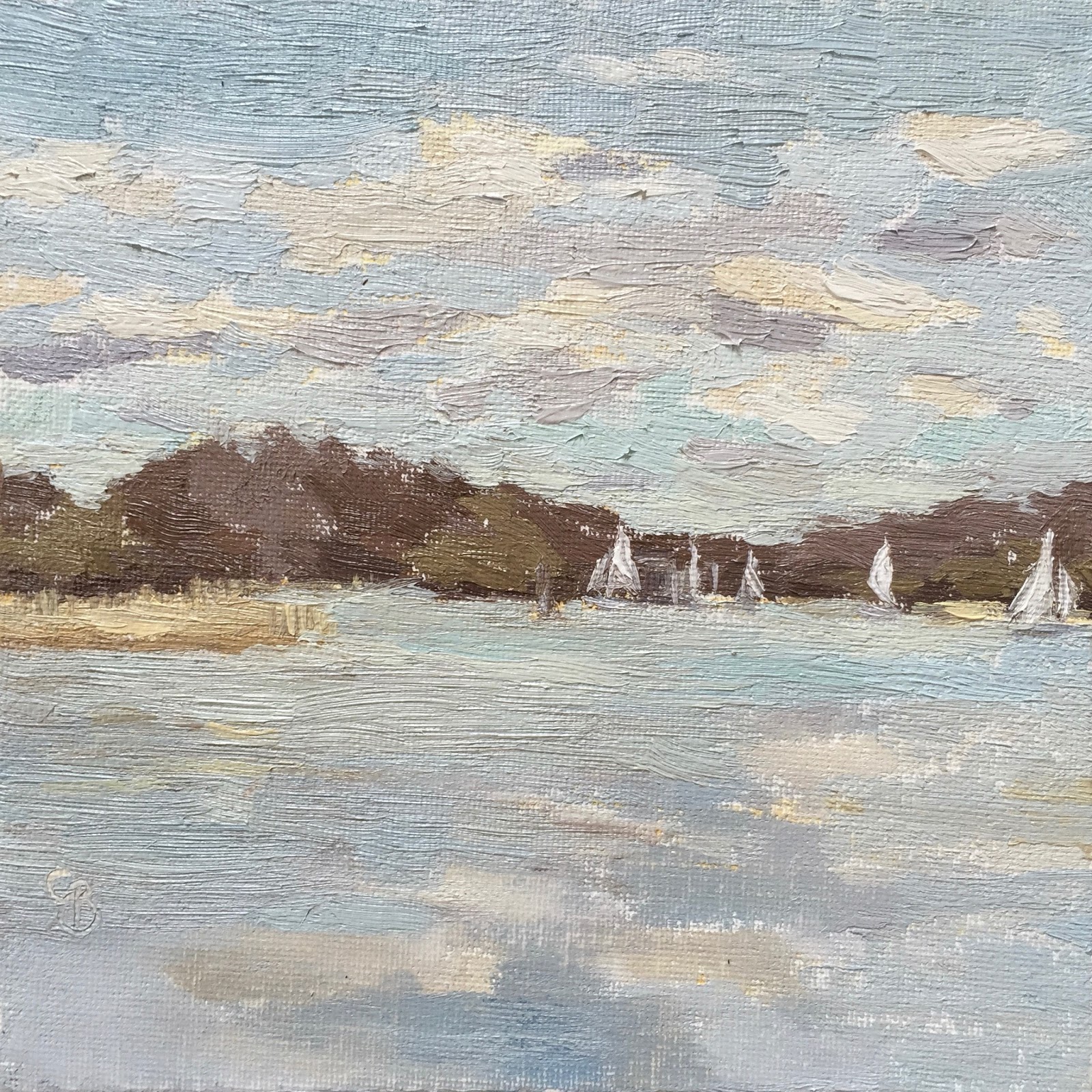
#59 'Sailing on Frensham Pond' 6x6"
They were doing a touch of Sunday sailing, the wind was good for them not so good for me. I had fleeting spells of calm where I could see the sky reflection which I raced to capture. The little sail boats were fun to paint in. I made sure the bank of land was a strong deep colour so it showed up the sails and contrasted with the pastel colours of the sky and water.
Thursday, 7 April 2016
#58 'Rose Cupcake' 6x6"
I was given this cute cupcake by Mirabelle Cafe in Haslemere. I painted one of theirs before and thought I'd have another go.
Some tough elements like getting the swirls of buttercream icing right and the red paper case. The background is often harder than the subject as it has to all work together and hopefully show off the subject even more. I'm pleased with the finished piece.
Wednesday, 6 April 2016
#57 'Aubergine' 6x6"
This is the second time I have painted an aubergine, the first was back in January.
I thought it would be a good subject for my students to try as it is very dark in tone but richly coloured and very shiny as well.
I enjoyed painting it I hope they will too :-)
Tuesday, 5 April 2016
#56 'Courgette & Tomato' 5x7"
I am pleased with the vibrancy of the greens and reds. The colour charts I made last week were helpful in the colour choices and mixing.
This painting is an aid my students when they will tackle a courgette next half term.
I enjoyed painting the different greens of the planes of the courgette. I also really obsereved the shadow betwen the two vegetables, it has lots of colours and tones.
Saturday, 2 April 2016
#55 'Camber Docks, Fishing Boat' 6x8"
I broke the boat down into shapes (as though I was painting a jug!) and simplified where I could. The reflections weren't strong but enough for me to work with.
I will go back and do more at Camber Docks, it was lovely to paint in the sun too and not so bittery cold!
The picture below shows my painting near completion - it took two and half hours. I used my new 'Open Box M' Pochade from America for the first time. It worked like a treat. I put a piece of acrylic plastic in the mixing palette which is easier to mix on and clean off. Plus my Husband made be the very nifty paint brush rest you can see on the right. So chuffed.
Friday, 1 April 2016
'My Hand' Pen & Ink
I decided to have a go at drawing my hand, which I've not tried before. I enjoyed it and will do more as it's a great workout for drawing skills, no bluffing you have to draw what's there or else it looks wrong.
I also had a go at doing a quick sketch of my husband Nick while he was digging - ready for a wild flower bed :-) Quite hard to draw when someone is constantly moving. But I decided on the pose and then waited until he did that movement again.
I used a new pen I'd not tried before called 'Tombow Dual Brush Pen' its great because it's double ended with a thin nib one end and a brush like tool the other but the good thing is it's water soluble so I went over two of the hand drawings with a paintbrush full of water and it moves the ink around and adds depth and tone.
Using a pen to draw with is not for the feint hearted as there's no rubbing out and every mark counts!
Subscribe to:
Posts (Atom)