Wednesday, 12 October 2016

#132 'Charmouth Beach, Dorset' 6x15.5"


Charmouth is just a couple of miles from Lyme Regis, the cliff in the middle distance is called Golden Cap and is the highest point on the South Coast, it's completely flat on the top.
I watched an inspiring plein air painting DVD by Richard Pikesley and he was painting on this very same spot! 
Love this sort of coastline and could paint here every day. Just the changing weathers, light and tides :-)
P.s. My painting is photographed on the easel because a narrow panoramic format doesn't work so well on the blog - it's too small.


Tuesday, 11 October 2016

#131 'Sunrise, Lyme Regis' 8x10"


This weekend Husband and I had a whistle stop trip to Lyme Regis on the Dorset Coast. We only spent 26 hours there but enough to explore and do 3 paintings :-)
This was actually the second painting, I want to revisit the first tomorrow and then post it.

Gorgeous, calm sunny morning, although very chilly! Sunrises tend to be more fleeting than sunsets, so you have to paint like billio to capture the sky and light. I enjoy the challenge! Most of the painting is a variation of blues and browns/oranges and then it's getting the tones right and working together.
I didn't now how I was going to tackle the little bit of town showing as it was a mass of buildings. Simplify! I put a sweep of dark and then painted over the top with lighter shapes, picking out the roofs and taking care to paint the skyline carefully.

Thursday, 6 October 2016

#130 'Rainy Day, Victoria Embankment' 9.5x12"


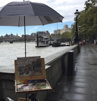
This was the painting I started last weekend outside in London.  It was a complex subject and good size painting to tackle en plein air and in the rain! See pic below.


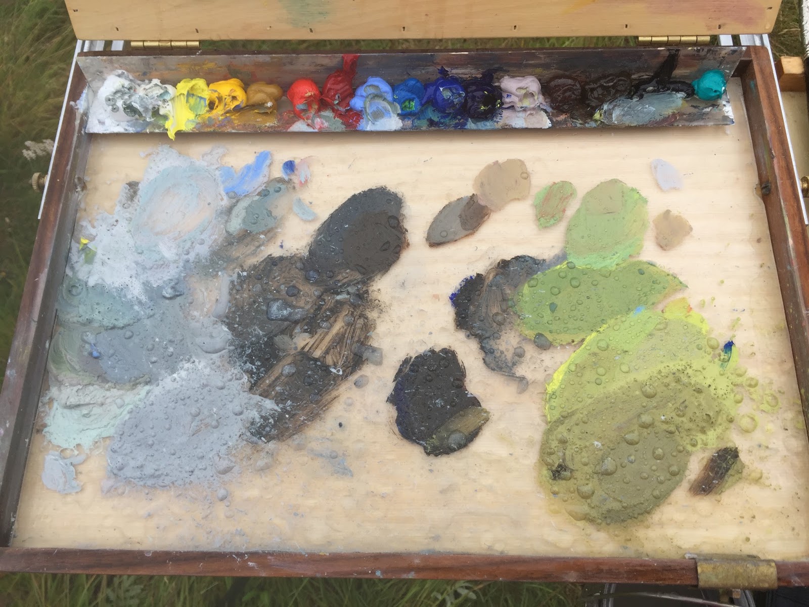
I used my 'Best Brella' for the first time and it was a boon! I couldn't have painted otherwise as it was raining too hard. Didn't stop me getting cold and wet but my palette and painting was dry! You can buy the pochade umbrellas from America, same people as the Palette Garage.
I experimented with colour themes I wanted to emphasis the rainy grey day but when I got the painting home it looked very grey and washed out. So I left it to dry and re worked it, I'm happy with the result, especially the composition.

Sadly I didn't get into the Royal Institue of Oil Painters Exhibtion. (ROI) But I'm really pleased to have got 2 paintings through the first round, it shows I'm on the right track and will keep trying with the London shows :-) Some stats for the ROI all approximate: 1000 people entered online 300 got through the first round 95 through into the final exhibition. 


Monday, 3 October 2016

#129 'The Bridge, Waggoners Wells' 9.5x12"


A beautiful sunny day and great to be out painting again for the 3rd day in a row! I previously painted this bridge and trees from the other side on the 18th September no.124. The leaves are just turning and the ones one the ground are orange, which I made full use of :-)
I put the struts of the bridge in before painting the water, plus the dark tones of the tree trunks - see pic.

I painted the background trees and their reflection at the same time, lightening a little for the water. Putting in all the dark areas under the bridge, which then showed up the light in tone of the little waterfall. Fun to paint moving water! Quite a big painting for me and plein but satisfying to do. Will go back to Waggoners when the leaves colour up.

Sunday, 2 October 2016

#128 'Surrey Hills' 6x15.5"


Lovely light on the morning hills, really blue and pale. I used a new wood panel by Gerstaeker called Tintoretto, I had prepared it with three layers of acrylic gesso, and it was really nice to work on, the paint glided but didn't sink into it. No need to frame either as its a box style.
I was careful to get the tone right of the hills as they weren't much darker than the sky. I used a new colour - Cadmiun Orange. Quite potent use very little of it, mixed with Lemon yellow for the sky line plus I then used the mixed orange into most of the other colours this helps with the harmony and giving it a warm feel. It was fun to paint on the panoramic style I recommend having ago if you haven't tried it.

I went to London yesterday and did a plein air next to the Thames, it was raining and I choose a tricky subject, it needs work so will post soon.

Thankfully my dog Matte has turned the corner and is better although his sight hasn't come back yet. But he's well enough for me to get out painting again :-) and thank you for your good wishes for him.


Wednesday, 28 September 2016

'Gladioli' 20x30"


I fancied getting my teeth stuck into a large (nearly life size, A1) charcoal drawing. We had these flowers which were on their way out but still great shapes. 
I used a fat charcoal stick for most of it which was like a paint brush I wanted it to be bold but delicate. To really observe every area and as I was doing it reminding myself 'dont assume what it looks like but to really look!' I used the negative shapes between the flowers to help. I also used a rubber drawing with the charcoal first and then sculpting the shapes with the rubber and then redrawing over the ghost shape again. The tone was interesting too with very deep pink flowers darker than the greenery and a fine balance in getting the flowers dark but not too heavy looking.
It took all day to do it, quite satifying watching it emerge, and doing something large scale.
Drawing is so helpful for painting skills. 

Sunday, 25 September 2016

#127 'Leaving the Harbour 2' 7x9.5"


This is the same subject as yesterday but I experimented with different combinations - a warmer blue, Ultramarine base. Paint thickness, putting it on in thick strokes, no medium to thin it. Letting some of the dark tone underapitnign show. 
This was the underpainting using the Gamblin Gel medium for quick drying purposes.
I enjoyed putting the light sparkle on the sea, when it was such a dark base it really showed up. Paying attention in getting the tones right of the sky, sea and sparlkle combo. The sparkle being the lightest in tone.
Having completed this one I put it next to the first and then adjusted the first in tone, making it a little stronger and punchy.
Fun painting these two. Will have to find something else now...

Saturday, 24 September 2016

#126 'Leaving the Harbour' 7x9.5"


This weekend I was planning on going to 'Brush with the Broads' its a plein air painting festival on the Norfolk Broads. I had to cancel as my dog is very poorly again with an eye ulcer and has gone blind ( I really hope it’s temporary) with administering eye drops every hour I can't get out to paint so I am making the most of studio work instead.

I found a photo I took as an aid memoir to go back and do a plein air, the sailing boat is coming out of Hayling Island Sailing club going out into the Solent. I like the light and tonal harmony. I haven't used photos up to now but decided it would work as a simple subject which I can experiment. In contrast with being outside and painting, its more just getting it down in a short time. In the studio I can think more and play. 

I started in a similar fashion dark and thin paint but adding a glaze medium I’d not used before called Gamblin Gel it’s supposed to dry the paint more quickly but keep the translucency and thickness. It did give it a nice sheen and flowed well across the board. Doing a first layer it's easier for it to be a bit drier when applying the second layer and the glaze helped.
The second layer I made thicker than I'd usually go and showing more of the brush strokes. I made the mistake of doing the sea too dark in tone to start with and I did several layers on top, it didn't work so I scrubbed it off and did this layer quickly and confidently I wanted to keep the same feel as outdoor painting being not too laboured. 
I started another painting of the same subject, doing it differently I will tackle it tomorrow.

Thursday, 22 September 2016

#125 'Sunrise, Frensham Pond' 8x10"


An early start, the sunrise came up opposite this view and only just tinged the scene in colours. The pond was very quiet apart from the coots and more hens and occasional dog walker. It such a great way to start the day, next to the water and totally focused on the painting and subject. 
I love the reddy pink trunks of the pines and the little cafe nestled in the trees. 

Sunday, 18 September 2016

#124 'Wagoners Wells' 8x10"


This National Trust beauty spot in Hampshire, is just down the road from us. I had the idea to paint here as I did a sketch of it in March:
I adapted the view as I love the big trees in foreground.
I had limited time to paint it which worked well as I didn't fuss with the foliage! I made areas of muted greens for the back greenery and then painted the brighter greens on top with more leaf shapes. This helped to not put all the details in but still suggest its trees and branches.
I enjoyed painting this - the photo doesn't do the colours justice!


Wednesday, 14 September 2016

#123 'Sunrise, Bosham' 9.5x12"


I had planned the night before that I wanted to be in Bosham for sunrise I left at 5am but arrived and it was still dark, I held off setting up as I couldn't see the view! 
I put my easel right next to the water as it was the best view. I thought the tide was at its highest.  
As the sun rose it lit the clouds and they gave a magnficent show. You have to be so focussed and fast to capture such fleeting colours. I mapped out the building and treetop line and went for it. Beautiful pastel colours, really enjoyed painting it.
I knew I didn't want to put massive detail in the buildings so I tried painting them in a sweep blocking the colours together and then defining the shapes later with lighter tones and brighter colours, it seamed to have worked.
Being so focused I didn't notice the sea water was lapping around my shoes! To my horror all my painting gear was bobbing in the water!! I grabbed my brush holder and all my brushes fell into the water and were floating, thankfully I could grab them all but a little stressful when it was such a previously calm scene! 

Thursday, 8 September 2016

#122 'Red Door, Haslemere' 8x8"


I have been saving this painting to post, as I did it during a painting day with Haslemere art society a few weeks ago. I've only just joined them, a friendly bunch, and I am in their annual exhibition starting Saturday at Haselmere Museum.

I made the mistake of liking this subject but initially painting too big an area of it. The first attempt had the whole door and some of the street, it didn't work, and I scrapped it and started again. This time really honing what it was I liked about the subject, and making a stronger composition. Pleased with this version now!

Tuesday, 6 September 2016

First Round ROI!


As I said in the previous blog I entered some paintings into the Royal Institute of Oil Painters at the Mall Galleries London. I have managed to get the above 2 through the first round, sooooo pleased and feel like I'm on the right track with my work.

All things crossed that I get through the next round as then I will 'hung' in there yearly exhibition! I have to wait till 1st October when I'll take them to London for the next round!

Sunday, 4 September 2016

#121 'Race Day, Frensham Pond' 7x9.5"


I've had a few days break form painting. But still really busy lesson planning for start of teaching next week, we are doing some landscape painting which will be fun to teach. Also framing work ready for 3 exhibitions coming up. One locally with Haslemere Art Society and the other 2 submitting work into London exhibitions to hopefully get selected. I'm trying the Royal Institute of Oil Painters and the Discerning Eye Exhibition at the Mall Galleries. I will let you know how it goes, all things crossed! I have heard from one of them and will post results tomorrow!

I fancied painting the boats of Frensham Pond I looked up when they had they were racing this morning. I set up near the slipway and met some really friendly sailors. 
They only went around the yellow buoys 3 or 4 times, I had to be quick in getting the yachts in. I painted the dark green foliage first so the sails would show up.
I really enjoyed the challenge of capturing a moving subject. Great place too, I may join the club so I can paint there more often, they kindly let me today as a guest.


Saturday, 27 August 2016

#120 'Tide Receding' 8x10"


I wanted to get back into painting after our trip as soon as I could, as it would be easy to not get back into the swing of it. 

I was wondering along looking for subject matter and this boat was next to Slipper Mill Pond in Emsworth. I like the shape of the boat and the reflection and being next to a wall made the white hull leap out.
I started painting and the owner kindly removed a ladder which was propped up against it. He ended up cycling around to see the painting (there was water between us) and I learnt a bit about the boat too. She is called 'Ngauruhoe' a New Zealand name from an active Volcano. The boat was built in the UK in the 60's and going strong!
I could see the water rushing out for low tide but hadn't judged how quickly it would leave the area mud dry! I did start to get the water in but had to finish at home from a photo. The reflection I did with thicker paint and a short flat brush.
I enjoyed painting the boat, although quite a complicated subject and hard to simplify. I kept in mind what was important and not put too much detail in the top half just suggested walls and plants. Also not used to the heat! Which is so contrasted to Iceland where I was waring 6 layers to paint, for this I had to ware suncream, hat ....
I'm pleased with the outcome :-)

Thursday, 25 August 2016

#119 'Icebergs, Jokulsarlon Iceland 4' 8x8"


We went further around the lagoon and these icebergs jumped out at me, also with the glacier behind.
It started spitting but being my final chance to paint in Iceland I grabbed it. Sadly within in 15 minutes it was pouring and I had to blow on my board to clear a patch of rain so the paint would stick and the same with my palette for mixing! I knew I was on a loosing battle so I packed up and continued painting from memory and a photo on my phone in our hostel room. 
I have been lucky that I finished all but one of the Iceland paintings outside.
The main colours I used for these icy paintings are: Cobalt Blue, Cobalt Teal (great for the turquoise) Raw umber, Blue-Black, Lemon Yellow & Crimson and of course white (Titanium).

Last night when we got home I laid out all my Iceland paintings I hadn't seen some of them in a while as I had put them together with matchsticks between to keep them safe - it worked well. 

I feel really pleased with the paintings I did in Iceland 14 in 12 days, worked hard and really loved it, an inspiring and amazing country. Husband Nick took 5500 photos! He loved it too! 
Thank you to the people who comment too, really helps to read your words of encouragement, keeps me going and especially when I'm out there doing it :-) 

Wednesday, 24 August 2016

#118 'Icebergs, Jokulsarlon Iceland 3' 8x8"


Due to the tides and flow of water the icebergs shift a lot each day some of them end up out of the lagoon and into the sea, so when we returned the next morning (Monday) it looked completely different and I found it harder to find one I liked so I painted a collection. More challenging as I wanted to make them clearly an icebergs and not an abstract of blues. I worked especially on the tonal contrast making sure I had a good range. 
Choosing big bergs I thought I'd be safer in their movement but the front light ones shifted and a different shape was formed.
The cloud level was quite low and the peaks of the Glacier mountain were obscured again another challenge to depict this. Also the weather had come in and the wind was really wipping around me I had to hold my pochade so it wouldnt fly into the water and hold my arm staedy to paint the fiddly bits as it was being blown around so much!
This was our last full day in Iceland and the boards I could paint on were very limited, I only had square left, amazing I had got through so many! (I have the last painting to post tomorrow.)
To finish this painting I put some seagulls in, they were circling around he 2 large bergs in the centre. I used the pointy edge of a short flat brush to do it, can you spot the birds they are tiny! I wanted to show the huge scale of the place.


Monday, 22 August 2016

#117 'Icebergs Jokulsarlon, Iceland 2' 9x12"


This was my second painting yesterday and my largest 'plein air' to date. Same Iceberg as the morning but different angle and lower down on the lagoon which allowed for a great reflection.
I started the same way with thin translucent paint and even let it run down the board a little, which adds to the watery feel.
I felt more confident in the subject although it did go through a long 'ugly duckling' stage and I nearly stopped half way. It not easy when you are constantly on view, people gathered around you and photographing! I also have to hold back with putting the light tone in, its better to get the dark foundations in and then put the lights, with the light colours it looks more finished.
It wasn't quite as bitterly cold as the morning and so the icebergs were slowly melting and 'carving' - pieces of them braking off, which can make thunderous sounds. It is such a magical place. I really enjoyed painting this one, and I'm pleased with the result.


#116 'Icelbergs Jokulsarlon, Iceland' 8x10"


Seeing all the icebergs and glaciers have a real wow factor with gorgeous blues and infinite shapes of bergs. Knowing I wanted to paint I felt a bit in awe of the place, where to start, how to paint it all? So I didn't paint the day we arrived, I needed to absorb it and get used to such an alien but beautiful landscape.
Saturday we arrived early before the crowds, there were sea lions playing quite close to the side of the lagoon, such cute faces.
An arrangement of icebergs stood out and I got to work immediately. I tackled it by not thinking of them as bergs but tones and shapes predominantly. Using the same method as the seascape rocks, thin dark transparent washes first and then building in stages of tones up to light - white and thicker paint. Trying also to keep it quite loose and brushy, as it seamed to suit the subject.
The dark area behind my bergs is the glacier, mountain and black sand - that's also what the stripes are. It adds lots of interest to them.
It was incredibly cold, the temperature drops around the lagoon and near the glacier, it was bitter standing painting, I had 3 layers on my legs and 6 on top! But worth the cold :-)
But saying that I enjoyed painting it more than I thought I would. I also had lots of lovely interactions with people, really friendly and interested.


Sunday, 21 August 2016

#115 'Sunrise Vik, Iceland' 8x8"


I was back in front of the church looking down on the rocks at 5am for sunrise, which happened a lot faster than sunset the night before. I didn't have time to paint the rocks in first. Instead I quickly mapped in the shapes and got to work on the sky. The colours were so fleeting but it helped having painted this subject numerous times before I had 'learnt' it in my mind, so I was able to paint it quickly.
This was on Friday and my last painting in Vik. I was sad to say goodbye as it had been such an inspiring place. We then drove all day to our next stop along the coast to quite a different landscape...

Saturday, 20 August 2016

#114 'Sunset Vik, Iceland' 8x8"

I stood in front of the church at 8pm, it was my last painting of the day. Being higher up it allowed me to see more of the sea which reflected the evening colours.
I put the rocks in first which gave me some structure to work around. - Dark and silhouetted. It felt a lottery to when I should paint the sky as I wanted the sunset to be at its peak.
A German lady asked while I was painting how do you paint this when it's changing to fast? And it was every time I mixed a colour and looked up the colours had changed or the clouds had moved! So once I started on the sky I committed to my mind what I saw the colours and shapes and then I painted like billio! I also took a photo in case I needed it later.
It was a challenge to get the colours light in tone but with enough colour and not to chalky. I'm pleased with how it turned out, with no time for overworking and it inspired me to do another one here  the next morning :-)

#113 'Vik Church, Iceland' 7x9.5"

 
I was standing a little way up a mountain to be eye level with this church. I thought it had an alpine feel and is actually very typical of Icelandic churches.
I simplified the scene and focused on the bits I liked - the contrast between the white building and the dark rocks. I used thicker paint then previous seascapes to emphasis the lush greens. The plain below the hill was so wide and expansive to the sea I had to reduce it a little for the composition and the board!
The distant cliff and land I made sure looked far away with very pale muted colours, not much darker in tone than the sky, to give a sense of space.
The sounds around me travelled and high up on the mountain were Oyster Catchers swooping and calling, they sounded like they were just above my head.

#112 'Dyrholaey, Iceland' 20x30cm

 
Thursday I completed 3 oil paintings in one day! That's my record so far:-) I will post them all today....
I decided to make the very long trek on the rock stacks beach to the other end to get a different view, see pic below.
It was early around 8am when I started painting. Just as I was about to begin a rainbow appeared nearly over my head. I could see the rain coming and battened down the hatches until it passed. - Had to show you this as it looks like the rainbow's coming out of my pochade!

My light coloured board was attracting midges and once the paint was on their they were all sticking to it, not easy to paint around! 
Iceland has huge spaces, its a big country and this view was still a long way away, although it showed off the sky well, and after the rain the clouds were interesting and I enjoyed painting them. My board was a different type again and you can see the weave of texture it has created. The light house gives this one scale, so tiny!
Husband Nick took this of me doing the long walk down the deserted beach!

Thursday, 18 August 2016

#111 'Evening Light Vik, Iceland' 5x10"


We drove around for a while trying to find a new view of the area. We went up the coast quite a few miles and found this deserted beach to paint on. It was nearly 7pm and I had a 20 minute weather window of sky and light, then the grey clouds came over. But doing a small painting I quickly got the sky in and the painting only took 50 minutes.
Painting on a beach that goes on for miles and miles with no one else on it has a good feeling to it.
Pat commented on one of my Vik paintings that it looks as though I'm enjoying doing these. I can't tell you how much! Absolutely sucking it up and making the most of our time here :-)

#110 'Vik Beach, Iceland' 8x10"


I did two more paintings yesterday from the Vik village side, where you see more of the rocks I thought they looked a bit like teeth!  I tried a more textured surface board and after a smooth board it felt strange and I didn't have enough paint on my brush a few times as it grips more. Not much sunlight and therefore little contrast between light and shade. Although the froth of the waves coming onto the black sandy beach was very strongly contrasted.

Wednesday, 17 August 2016

#109 'Reynisdrangar Vik, Iceland' 7x9.5"

 
I completed this second painting in the afternoon. The light changed half way through with the sun coming out which enriched the colours and contrast.
I walked down the beach it was hard going in the soft back sand and my gear. I liked the stacks smaller and at a different angle so I could see three instead of two of them - in the first painting.
I wanted to try and convey the energy of the sea, it was massive and so loud, with continuous spray in my face. I used lots of loose brush marks in the sky and sea. And putting some tiny figures in gave a sense of scale.

#108 'Reynisdranger Sea Stacks', Iceland' 20x30cm


I did two paintings yesterday, this was the first on such a dramatic beach at Vik, with black sands and sea stacks jutting out of the water, the seas were huge with crashing waves. Such an inspiring place to paint :-)
Vik is on the south coast of Iceland exposed to the Atlantic weather although we were lucky it didn't rain and the sun actually came out!
I was fairly close to the stacks (rocks) along with many tourists interested in the Puffins and me, lol!
I wanted a contrast of thin translucent paint and thicker opaque and being careful not to cover all the thin first layer. With the black sands the colours all harmonised and so I used a limited palette which added to the drama.
If Monet were alive and here I'm sure he'd love to paint in Vik as I do! His Etretat paintings remind of this area in Iceland.

Sunday, 14 August 2016

Painting in the rain! Iceland

 
I thought yesterday was bad, today was WET!
I started painting in the rain thinking I could muster through it. Husband left to photograph and I was left to battle. The rain was driving and my board and palette was wet within seconds. I kept wiping it down but each brush stroke was resisting my board and congealing in lumps! I thought I'm not going to let some rain beat me.....So I wiped and wiped and went through all the kitchen roll I had. My palette was actually flooding see pic below. I covered most of the board, but the strokes were a little laboured to try and make it stick, after an hour I was thankful to see Nick again. My waterproofs had worked for me but my painting kit was sopping, it's now drying on the hostel radiator.
My painting is ok, but not finished hence why I haven't posted it. I will look at again at home, when its dried out and see if its worth finishing.

Saturday, 13 August 2016

#107 'Arnarstapi Cliffs, Iceland' 20x30cm


The elements were against us today, still on the Western Peninsular we found this spot and within 10 minutes of painting the rain and mist came in, felt a bit like Cornwall! It was tricky as my view partly disappeared! And the rain was blowing in my face and eyes. My palette and board had a wet film on it, I kept wiping for dryer patches but it felt hard core! Thankfully after 45 mins the rain and mist cleared :-)
I liked the arch and waves crashing around the rocks. I heightened the colours as it was very monotone.
I enjoyed the day, even with the hardships. We are going whale watching tomorrow let hope we see some!


Friday, 12 August 2016

#106 'Skardsvik Beach, Iceland' 8x10"


First Full day in Iceland, we are on the Western Peninsular. The Weather forecast was cloud all day but the sun came out on this beautiful beach called 'Skardsvik'. The colours were like the Caribbean, I absolutely loved panting it!
The cliff and rocks are unusual because they are all made of lava from an ancient eruption. They were very dark in colour and almost black in the shadow areas. I used Raw Umber and Ultramarine Blue to make this colour (no white). I had to be brave in making it dark enough to contrast with the gorgeous sea greens. The sand (there is some speckled on the painting!) is also different because most of the beaches in Iceland are black, the shells on this beach make it the traditional yellow.
There were lots of tourists some paddling in the very cold North Atlantic Ocean and others watching me paint! Husband Nick enjoyed photographing waterfalls and lava fields. I'm chuffed to have completed my first oil painting abroad :-)

Wednesday, 10 August 2016

Flying with oil paints!


I have been busy gathering equipment for flying to Iceland tomorrow, we are there 12 days and will travel to three areas in a hire car.  Nick, my husband who is a semi pro photographer, its his dream place to go to, so I’m taking my paints as well, I’m sure its going to be rugged and stunning. We paid a good price for an extra case so I'm filing it nicely with all my gear! 
I haven't travelled abroad with oil paints before and have done lots of research for what’s allowed on the plane and how to pack it. You have to have a Safety Data sheet to tell people the paint is non flammable and safe. I have 5 sheets so far for all the different paint manufactures. I’m also trying ‘Zest it’ as its non-flamible, lets hope it all works!
The photo is of some of the equipment I’m taking! There are also bags, tripod and my main pochade easel...
I was sticking match sticks onto my boards last night can you see them on the backs? This is to transport the wet paintings. You put two boards with masking tape together and the matchstick gap allows the painting inside to be safe. (A great idea by the painter Ken Howard.) 
I have 7 sizes of boards! As I am unsure what I'll want to work on there, I have lots of choice! I’ve manage to get all the boards into my carry on the rest is in the spare case. 
I brought a mini pochade (see pic) by Guerrilla, it fits 5x7” boards, incase we do some hiking and I want to do a quick oil sketch.
I will be aiming to blog the paintings I do during the trip although I don't know how Icelandic internet will be and using Nicks laptop! 

Friday, 5 August 2016

#105 'Beach Huts, Hayling Island 2' 9x12"


These huts look simple but are deceptively tricky to paint, it was a struggle painting with lots of wiping off and angst! It’s the biggest board I’ve worked on to date. I wanted a long thin one, but my order for them hasn’t arrived yet. I like the line of huts but that meant a lot of sky it was hazy and not much to it, which is so much harder if you have to invent things instead of looking at nature. 
I wanted to the sea behind the huts which is 'contra jour' - looking into the sun and therefore most of the huts are in shadow. 
It's about a 40min drive to Hayling Huts from my house and yesterday the weather was so different down there, blowing a hooley, so much so I had to hold onto my pochade or else it would blow over! Even with my weighted bag hanging from it. See pics below.
While I was painting I noticed a guy photographing me, he came over and asked if I didn’t mind and he said it looked a good shot! So I asked for copies of them the 2 below are his - Trevor Carpenter, thank you!

Considering how much of a struggle and thinking nearly up until the end that this feels like flogging a dead horse! It's actually turned out ok. It shows you shouldn’t give up on a painting as it may come through in the end :-)


Tuesday, 2 August 2016

#104 'Hayling Island' 8x10"


I was so lucky with the weather and light. The colours were gorgeous, and I loved the contrasted sandy spit with the deep turquoise blue sea behind. 

I used fast thinly painted strokes to cover the board quickly, then go in with thicker paint over the top. 
It's right at the south tip of Hayling but looking north - towards the South Down hills, really like this area and will go back.