Thursday, 31 March 2016

#54 'Two Pink Jugs' 6x6"


I finished my colour studies this morning and wanted to use some of the lovely pinks and violets I had mixed. So this is the result of it! I didn't have many pink pots or jugs in my supply so adapted what I had, see photo below to what they really looked like!

They had unusual shaped spouts which made it interesting to paint. I also accenturated the size and shapes of the jugs to make a more pleasing composition. The main colours I used are: Magenta and Ultramarine with a little Cadmium Yellow Pale.


Colour Mixing Studies 'Green & Violet'


These two sets of colour charts took me two and a half days to complete! Very labour intensive but worth it, as it tunes up my mixing skills and I will use the charts for years to come for my own practise and in teaching.
They complete the Secondary colour mixing using all the colours on my palette (mainly Primaries.)

The above mixes are VIOLETS the colours I used are -

Cadmium Red, Crimson, Magenta
Mixed with:
Cerulean Blue, Pthalo Blue, Cobalt, Ultramarine, Blue-Violet & Violet 

Because Violets tend be naturally dark in tone I have marked a lighter tone next to some mixes.


The above mixes are GREENS the colours I used are - 

Cadmium Yellow Pale, Cadmium Yellow, Camium Yellow Deep, Yellow Ochre
Mixed with:
Cerulen Blue, Phathlo Blue, Cobalt, Ultramarine, Blue-Violet

You can see there are crisp acidic greens compared with the Cadmium Yellow Pale mixes and earthy-dirty greens with the Yellow Ochre mixes.


Monday, 28 March 2016

Colour Mixing Studies 'Oranges'


I am using my time off teaching this Easter to work on colour mixing & studies for my own painting progression and as an teaching aid.

The above is my palette with 4 yellows and 4 reds all mixed together to create -
ORANGES, 3 versions: Yellow-Orange, Orange & Red Orange


I want to improve on speed of colour mixing when I paint and having a chart to help me with colour combinations and comparisons at a glance. 
I will do more charts for my other 'Secondary' Colours - Violets and Greens.

Colours I used today are:
YELLOWS
Cadmium Yellow Pale
Cadmium Yellow 
Cadmium Yellow Deep
Yellow Ochre

REDS
Cadmium Red
Crimson
Magenta
Burnt Sienna

I used 24 different brushes to do these charts! - Which keeps the colours clean 


Sunday, 27 March 2016

#53 'Terry's Chocolate Orange' 4x4"


This is my "Easter Egg' from my husband so I thought I'd paint it! - and of course eat it later :-)

Some tough areas to work out, simplifying the silver foil wrapper but still showing the complexity and tones of the crimples. I haven't painted chocolate before, to get the rich chocolaty colours but also show the segments. I especially liked doing the label and the rich yellow-orange of the wrapper. The writing on the label only needs to be suggested and not properly written as it still looks like writing when it's a squiggle!

My dog Matte has been really poorly after his op last week hence not much painting, he's now hopefully on the mend.

Wednesday, 23 March 2016

#52 'Yellow & Blue Jug' 4x4"


A small painting today as I am looking after my dog who had an op on Monday. 
Loose brush and emphasising the shape of the bellied pot.
I used Blue-Violet and Cadmium Yellow Pale, plus some Cad Red, limiting the colours helps to add harmony.

Matte in my studio with his red electric blanket!

Sunday, 20 March 2016

#51 'Adidas Boots' 6x6"

These boots were a challenge to paint especially the laces! But I enjoyed all the different elements. 
I set up a casual composition as though they'd been taken off and left. The material is suede so there wasn't a shine or highlights. I worked on the different tones and undulations of the material. 
I could have kept tweaking and fussing but didn't want to overwork it and you got to know when to stop! I am pleased with the outcome.

Saturday, 19 March 2016

#50 'Earthenware Pots' 6x6"


I like the chunky earthen ware feel to these pots and not colours I usually choose.
They not fine china so I painted them quite loose and brushy. I decided on the blue background as a last minute after I'd painted the inside of the yellow pot, it seamed a good colour base to expand on.
Happy to make it to 50 paintings! Getting quite a collection in my studio now, I'm enjoying the variety of subjects and still the challenge of painting them :-)

Friday, 18 March 2016

#49 'Bramshott Common' 4x9.5"


I was out early painting this scene, it's one I see when I walk my dog. I did a sketch of it a while ago.
I was hesitant when I first arrived this morning as the scene was quite subdued with muted colours and no direct sunlight. See the photo below.  I decided to still paint it but intensify the colours that were there. I really like the shape of the silhouetted pine trees so made them a bit bigger than they were.The sky was nothingy so I put a warm apricot - a colour from some trees and put it behind the pines this also emphasised them (the camera didn't pick up this colour very well.) 
I am pleased with the final result especially considering what I was looking at!


Thursday, 17 March 2016

'Waggoners Wells' Sketch 7x9"


It was such a sunny day I had to get out and enjoy it. I didn't have the energy to do a painting after teaching this mornings class so I thought I do a sketch in preparation for a painting later.
Waggoners Wells are down the road from us, some lovely reflections in the 3 ponds there. 
I liked the wooden old bridge and shapes of the silhouetted trees. I drew it in a charcoal pencil which is great for dense darks and not to fine details. I will definitely go back and paint this scene.

Wednesday, 16 March 2016

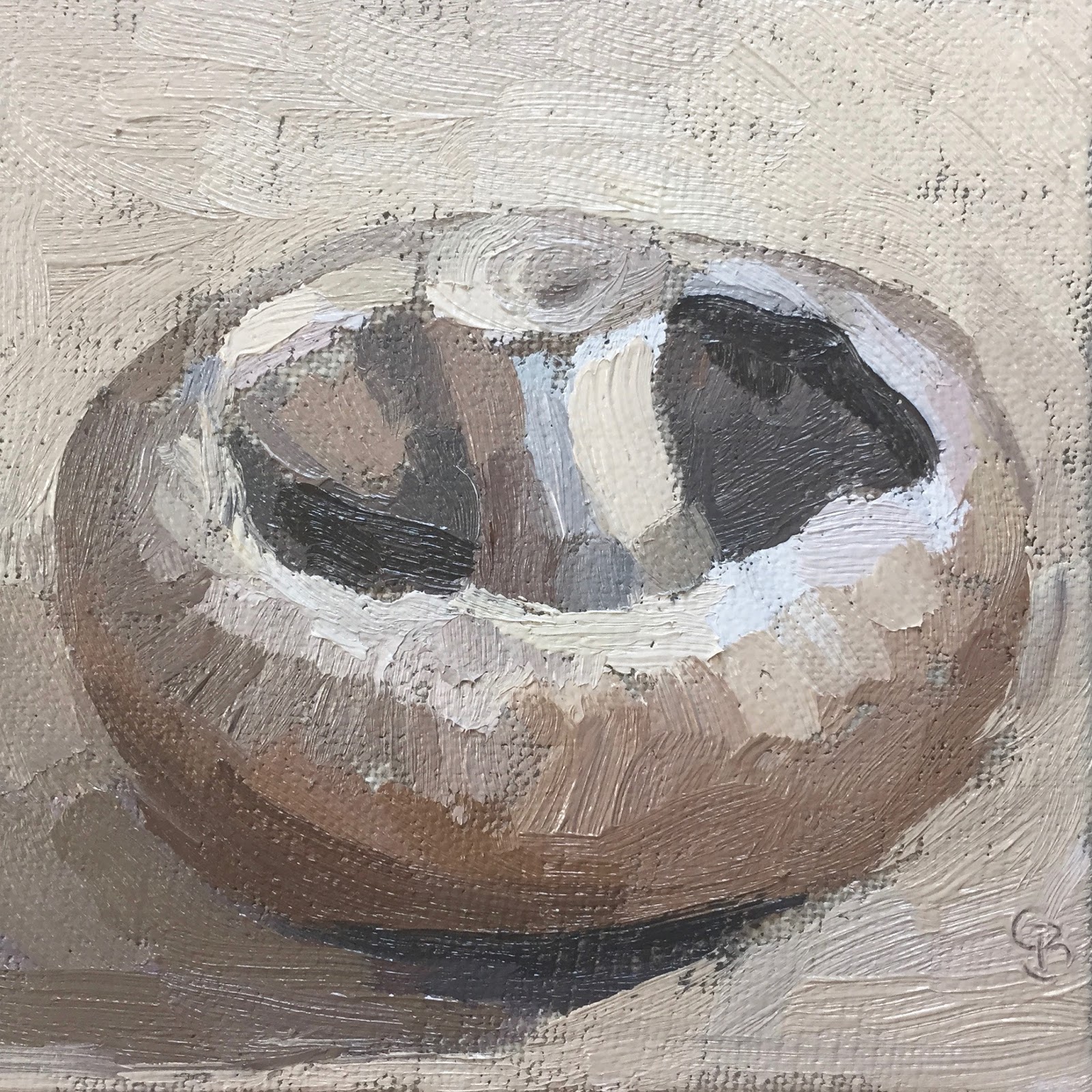
#48 'Mushrooms' 4x6" and 4x4"


These paintings are an aid for my students in next weeks class. They will be painting mushrooms and practise mixing greys and browns from the 3 primary colours - Red, Yellow & Blue and focusing on tone, the light and shade of an object.
They were a good challenge for me too! Observing subtle tonal changes and I enjoyed the rounded shapes and cut in half mushroom :-)


Saturday, 12 March 2016

#47 'Frensham Little Pond' 6x8"


I waited till the fog had cleared where we live and drove the 15 minutes to this pond. It was still foggy but actually looked really atmospheric and pretty. By the time I was ready to paint a lot of the fog had cleared but I still kept it quite tonal. I simplified the tree shapes and little house. The reeds were a a lovely yellow ochre colour - which I mixed with my three primary colours. 
It felt a very tranquil spot even with the many dogs and people passing and I will definitely do more in this area. 

Friday, 11 March 2016

#46 'Turquoise Pots' 6x6"


I love these colours! I decided to harmonise with a similar colour background. The composition isn't one I usually do from above, I will experiment from the side view too. 
I used a colour I haven't tried before 'Phthalo Blue' a very strong turquoise great for these sorts of colours. 
I'm pleased with the loosenes of the brush work, not being to fussy but still getting some finishing detail.

Wednesday, 9 March 2016

#45 "Red Onions' 6x6"


This one is for my students and our class next week. We'll be working on Complementary colours of Red-Violet and Yellow-Green they go together well and tone (light & dark) in colour.
I peeled one layer off the onion to revel a shiney richer surface. I like the top and bottom of the onion and they were the fun bits to paint.

I painted a red onion in the beginning of my daily painting no.6 nearly 40 paintings later there is a difference! Painting small and often definitely improves your skills :-) 

Monday, 7 March 2016

#44 'Sky Studies' 3x4"


These two little studies I painted from my studio window. Great light, with scudding clouds across the sky, although each time I looked out to observe them they had moved! I quickly sketched the main shapes in with the lightest tone and then built from there.
Fun to do and will do more, it's great practise to paint skies from life.

Friday, 4 March 2016

#43 "Devil's Punch Bowl' 6x8"

I started this with bright sunshine and fluffy clouds and as I finished it started to snow! (V. Bitter!)
My emphasis was on the sky today, so I made it a bigger proportion of the painting. I did the clouds first and then the sky around them, see pic below. 
I wanted to give a feeling of space and distance. I also made sure you could see the light shining on the trees.
I feel blessed that this National Trust 'beauty spot' is only a few minutes drive from my house, it's great for sky scapes :-)


Wednesday, 2 March 2016

#42 'Mary Janes' 6x6"

I enjoyed painting these shoes. Although I felt a little daunted in the beginning as I have not painted shoes before but I just broke them down into shapes and didn't think of them as shoes! And then as I'm painting the shoes appear - and the're so cute :-) 
Patent material is very shiney but also quite dark in places, and interesting shadows too.

Sunday, 28 February 2016

#41 'Vinaigrette Bottle' 4x6"

With each painting I do I try and challenge myself, whether it is with composition, colour, being outside...today I decided to do my first pattern on my subject. There was a pattern on the bottle but I took it sa a starting point. I painted the pattern first (so there was no going back with putting it in!) See pic below. I did the basic leaf shapes and then at the end painted lines over the leaves to bring them to life. 
It reminds me of Raol Dufy, an artist I studied at art school, he put illustrative lines over colour.
I also was brave with the background colour, using a strong, dark blue-violet, which makes the bottle pop out! I'm happy with how this turned out.

Saturday, 27 February 2016

#40 'Emsworth Harbour' 4x9.5"

I stood on the mud flats as close to the water as I dared. I checked the tide times and  knew I had a good 2 hour window before the water would be lapping at my ankles. 
It was bitterly cold again but I was dressed for it with ski trousers and thermals, hand and feet warmers tucked into my shoes and fingerless gloves. 
This board I had been saving for an occasion, it was one I'd made out of ply and muslin, a perfect panoramic shape for capturing the sweep of the tidal water.
I painted the little boats in first, see the pic below and then the mud flats, there wasn't much sunlight so hardly any shadows, when a peep of sun came I put in the water. 
I enjoyed the experience and although bitterly cold and exhausting it feels worthwhile!


Friday, 26 February 2016

#39 'Three Little Jugs' 6x6"

I found these jugs in a charity shop yesterday. A great find as they were all small and complemented each other in their blues and creams, I like the varied shapes as well. 
I kept the colour palette limited to give it harmony. I also painted a ground colour using mainly Burnt Sienna, you can see it showing through the brush strokes, the ground colour gives a unity to the whole. I'm sure I'll paint these little jugs again!

If you have signed up for my posts to be delivered to your inbox, it seams its rather hit and miss as to whether you receive it or not I don't have control as to whether it happens. If it's stopped working try signing up again. Sorry and I hope you are enjoying my work :-)

Monday, 22 February 2016

#38 'Old Copper Teapot' 8x8"

A tough subject, I usually don't have trouble mixing a colour, in this painting I mixed lots of options as there are many colours that make up this old teapot.
The oxidation on the base of the pot gave me the the colour idea for the background. 
The shape of the shadow is interesting and I moved my light to make sure it fitted within the composition.
This is one of the most complex still life daily painting I've done so far and I'm happy with the result :-)

Sunday, 21 February 2016

#37 'Orange Studies' 4x4"


I started the top one on a natural coloured board but decided I would do two studies at the same time to experiment with background colours, composition and to compare with a white ground and a coloured ground (see pic below)
I was aiming for the orange to be luminous and fresh looking. I did this by using very little white in the orange mixture and keep the brush strokes to a minimum. The two coloured backgrounds (white/blue & green) give a different feel to each painting.
I haven't cut up and painted fruit or veggies before so it's a good start.


Saturday, 20 February 2016

#36 'Little Jug' 4x4"

I have had the 'lurgy' the past few days, bad cold and cough with no painting. So it's good to get back to it today.
I like the shape of this little jug, reminds of something in the Dutch masters time - Vermeer, 'Girl with the Pearl Earring'.
I tried a different board today, no white primer, instead a clear primer to show the original colour of the canvas wrapped around the board. It was a joy to paint especially with the light colours it really showed up. This was one of those paintings that evolved it's self, with a little help from me!
You can see the raw canvas board showing part way through the painting.

Tuesday, 16 February 2016

#35 'Comice Pear' 6x6"


One for my students, we will work on planes (surfaces) of a subject and harmonious colours. 

It was surprising how yellow the pear was, you think a pear is green so to truly see it I cut out a little hole in a piece of paper and looked at the pear, this isolates the colours, so you are not distracted with other colours around it. It helps to see what's really there not what you think is there!
I like contrasting bright colours, I originally wanted to put the pear with a blue background, but changed my mind once the pear was done I felt it need harmonious russet colours.
I also enjoyed the slightly different composition, having the corner and sides, it gives a sense of space.

Monday, 15 February 2016

#34 'Lisianthus' 5x7"

These flowers were in my bouquet I had on for Valentines day :-)
I like the wispy delicate buds and rich deep flower heads. I had a go at drawing it before thinking it would work as a coloured drawing. But the colours were so wishy washy compared to oils I had to then have a go at painting it! 
I kept it very simple with the detail of the flowers but emphasising the purple colours and using a light touch with the creamy buds.
Painting beginnings ....

Sunday, 14 February 2016

#33 'Happy Valentines Day' 6x6"


I brought this rose for my husband for Valentines Day. It's the first time I have painted a rose, it's not easy but I enjoyed it. Its called a Naomi rose, with soft velvety petals.

I painted it being totally unsure as to how it would turn out, I used lots of rich reds layered wet into wet paint. I'm pleased with my first attempt and look forward to doing more. Possibly soon as I had a pretty bouquet from hubby today :-)

Friday, 12 February 2016

#32 'Large Mint Teapot' 7.5x9.5"

I elevated this teapot to see the squat rounded shape. It was fun to paint, broad painterly brush strokes and the gorgeous mint colour. 
I changed the board 3 times before I was happy with the preliminary drawing. It needed to fit the parameter well. It's on a canvas with a 'ground colour' already applied and dried - see pic below. I will use some more ground colours especially with light subject colours as they really show up well and it brings a unity to the whole as small parts of the ground colour show through.
I went for a strong dark tone of purple for the background, I wanted the lovely shape of the teapot to stand out.
Beginning stages of the painting...

Thursday, 11 February 2016

#31 'Pine Tree, Devils Punch Bowl' 6x8"

A glorious weather day! It was wonderful to be out and painting in the Punch Bowl (Surrey.) Rather chilly though and as I'm not used to working outside yet it takes me ages to do even a small painting 6x8". I was there two and half hours and by the end I couldn't control my brush with the shivering! 
New things were tricky like the sunlight shining on my board and distorting the palette colours so I stood in my shadow. I had my back to a path which was very busy with dog walkers and people enjoying the sun. I found it a little distracting especially as they could see my painting form the path, I wanted to say 'don't judge it yet, it's not finished!' 
Doing this today it makes me realise how much I still have to learn with painting en plein air (outside) but it gives me impetuous to do more!

Tuesday, 9 February 2016

#30 'Strawberry Cupcake' 6x6"

I brought this tasty looking cupcake from a local cafe in Haslemere called Mirabelle. 
I've never painted something like this before, and it was a challenge! Getting the detail without loosing the freshness and making the colours work together as a whole. 
I am pleased with the outcome and a bonus I get to eat the cupcake now with a nice cup of tea!
I just wanted to show you my new easel 'small board holder'. It's perfect! My husband has been busy and made this for me. It prevents shadow overhang as you can see the top of the easel and I can get to all of the board without the easel getting in the way.  

The VIDEO of how I painted #29 Bramley Apple


This is the video I shot yesterday while I was painting the Bramley Apple. It's just under 4 minutes long and shows me doing the painting from start to finish. (A speeded up version)

I've never done this before, one of my students encouraged me to try. I hope it gives a glimpse into how the painting developed. Let me know what you think of it!

I will be doing more painting videos. (With the help of my husbands editing skills :-)


Monday, 8 February 2016

#29 'Bramley Apple' 6x6"


This cooking apple is another one my students will tackle. We will focus on the Edges, Shadow and Background. 
I propped the apple up high so I could see the shape of it - lovely and fat. I wanted to convey the weight and size, especially compared to the 'Little Braeburn' I did a while ago.

I have decided to film some of my paintings, the progression of how I put the paint onto board and see the painting grow - it will be a speeded up sequence. I set up the camera today to have a go, it felt a little daunting with it over my shoulder watching every move! About 30 mins through my battery ran out! So I charged and came back to it. I will put the edited video on here once it's done. My husband is kindly helping me with it.

My palette of earthy colours.


Sunday, 7 February 2016

#28 'Orange on Blues' 6x6"

This painting is for the oil painting course I run, it's their next lesson after half term - Orange and Blue Complementary Colours. My students will do a similar painting and some colour mixing see chart below.
I did an orange back on Daily Paint no. 2 I had a look at it when I'd finished this painting to compare, this one is much richer and more vibrant, and generally more confident :-)